

Yeah, the title is provocative.
Of course, I have nothing against storytelling with data: it’s a great way to prove points and impact opinions. Experts in the data space proved how storytelling can be crucial when working with data: check out the great work by Cole Nussbaumer, or have a look at most of the visualizations published by Andy Kriebel.
However, as storytelling is usually widely celebrated, here I want to put a spotlight on the other face of the #DataViz coin: Exploration.
Explorative data visualizations are interfaces that allow users to ask questions to a dataset, and find their answers. They embody the concept of “Guided Analytics”, and are usually found in the form of dashboards of interactive and inter-related charts and controls. As we strive for a more transparent, informed and data-driven society, I genuinely think exploratory data visualizations can be as powerful as storytelling.
In fact, because they don’t aim to change opinions, they empower people with visual instruments to check what’s going on themselves. Thanks to Data Explorers, people can make sense out of data when they are complex and - yes - big.
#1 Open data and the open source paradigm
Governments and Institutions opening their data to the public represent a promising trend for transparency and overall advancement of our society. The ability of the public to access, download, copy, and analyse datasources, provides great foundations for startups to build amazing products, or for data journalists to dig stories out of numbers. In this interpretation, the Open Data trend is a powerful expression of the wider open source paradigm.
But is this enough to make us a transparent and informed society?
During his talk at the #Data16 conference in Austin, my colleague and coach Chris Love synthesized with this slide the different levels of guidance through which analytics can be deployed to users:
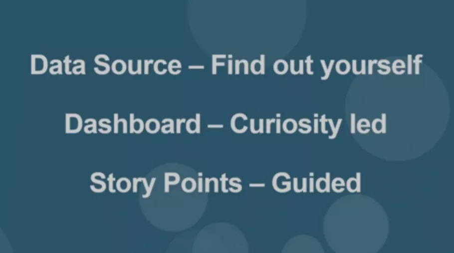
Making data sources available to un-guided analysis is the foundational step of the whole thing. They offer none or few guidance to the user, unleashing a virtually infinite set of interpretations. The main challenge here is maintaining data always up to date, properly documented, and at the highest level of granularity.
Usually this stage is embodied in portals like data.gov.uk or data.europa.eu, which offer data of all sort. Upon those data, users can build their own analysis, provided that they have time, knowledge and technology.
On the other side of the guidance spectrum, Storytelling is the art of leading the users to a specific point or insight, through showing the data that backs it. This is the realm of Data Journalists. They leave none or few freedom to the users, and instead they offer ready-made data-driven stories to inform them about the state of the world.
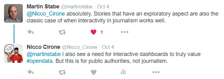
In October, Martin Stabe - head of interactive news at the Financial Times - explained this concept in a great article about “why the FT creates so few clickable graphics”. His main argument is that interactions distract the users from the story, and force them to take actions like clicking, hovering, selecting or inputting to get to the message.
His point of view is the one of a storyteller. I do agree with Martin, storytellers and data journalists must do all the heavy lifting for their readers, both under a technical and an analytical perspective.
However, as much as we need good portals to get data and great data journalists to tell stories, we need Data Explorers to truly unleash the real power of data to society.

 #2 The role of Data Explorers
Nowadays Business Intelligence is living a pardigm shift, from IT based reporting systems to Self Service analytics. Business analysts can use softwares like Tableau to get insights from data and build dashboards to guide decision making, without the need of coding.
How can we apply this evolution to open data?
What we have now, is a bunch of Open Data portals like the one below, from which we can download files in different formats.
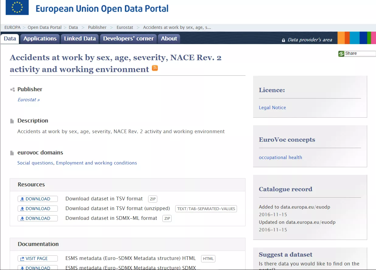
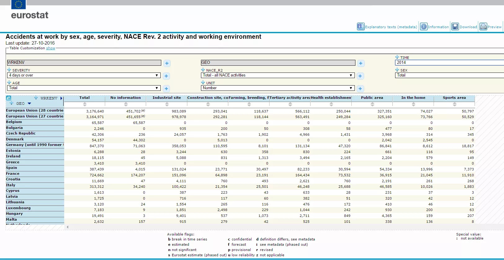
If we are lucky, we can find something like a reponsive and filterable pivot table, to help us through the datasets. Sometimes, we can even build basic charts out of the web based app.
Provided that the data is always up to date and accurate, this represents a great starting point for both a Data Journalist and a Data Explorer.
Both will probably start with some un-guided analytics to find interesting angles and insights, but very quickly they will split their paths. The former will find out interesting stories to tell the public, the latter will transpose the whole dataset into an exploratory dashboard, with a self-explanatory UI, to guide the public to their own insights.
A Data Explorer will probably come up with something like this:
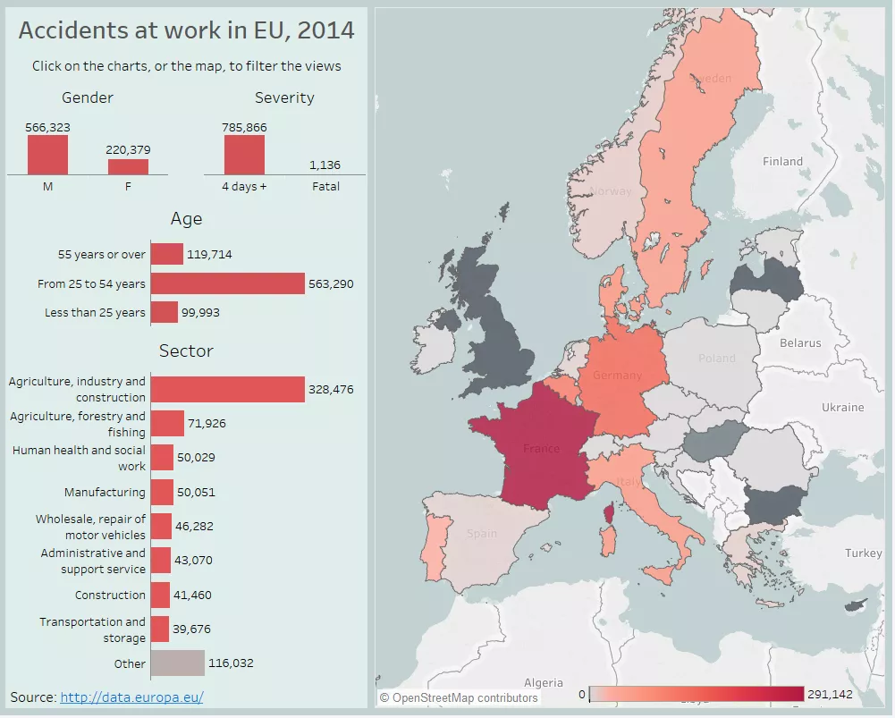 Click to go to the interactive dashboard
Dashboards like the one above give visual clues to explore the underlying dataset, and because the charts are interrelated, it’s easy to filter the view to the perspective we are more interested about.
At the same time, the power of data visualization allows us to get a couple of key information at a glance, like the most dangerous sector and the countries with highest and lowest number of accidents.
Imagine a world where people can access Open Data in this visual way, through exploratory dashboards plugged on datasets of all sort: employment data, health data, political data. We could finally use data to make educated decisions, fact-check political statements, asses the performance of legislations and public investments.
Of course, visualizations like that are only as good as the underlying data, and all the caveats of the metadata must be reported on the visualization as well. Moreover, despite the advancement of self service analytics, we still need some technical knowledge to visualize data in a compelling and effective way.
That’s why - to move toward a transparent and informed society - we need Data Explorers: to find paths, and to build instruments for helping the public making sense of Open Data.