A travel journal of my adventures in data
Category Data Visualization
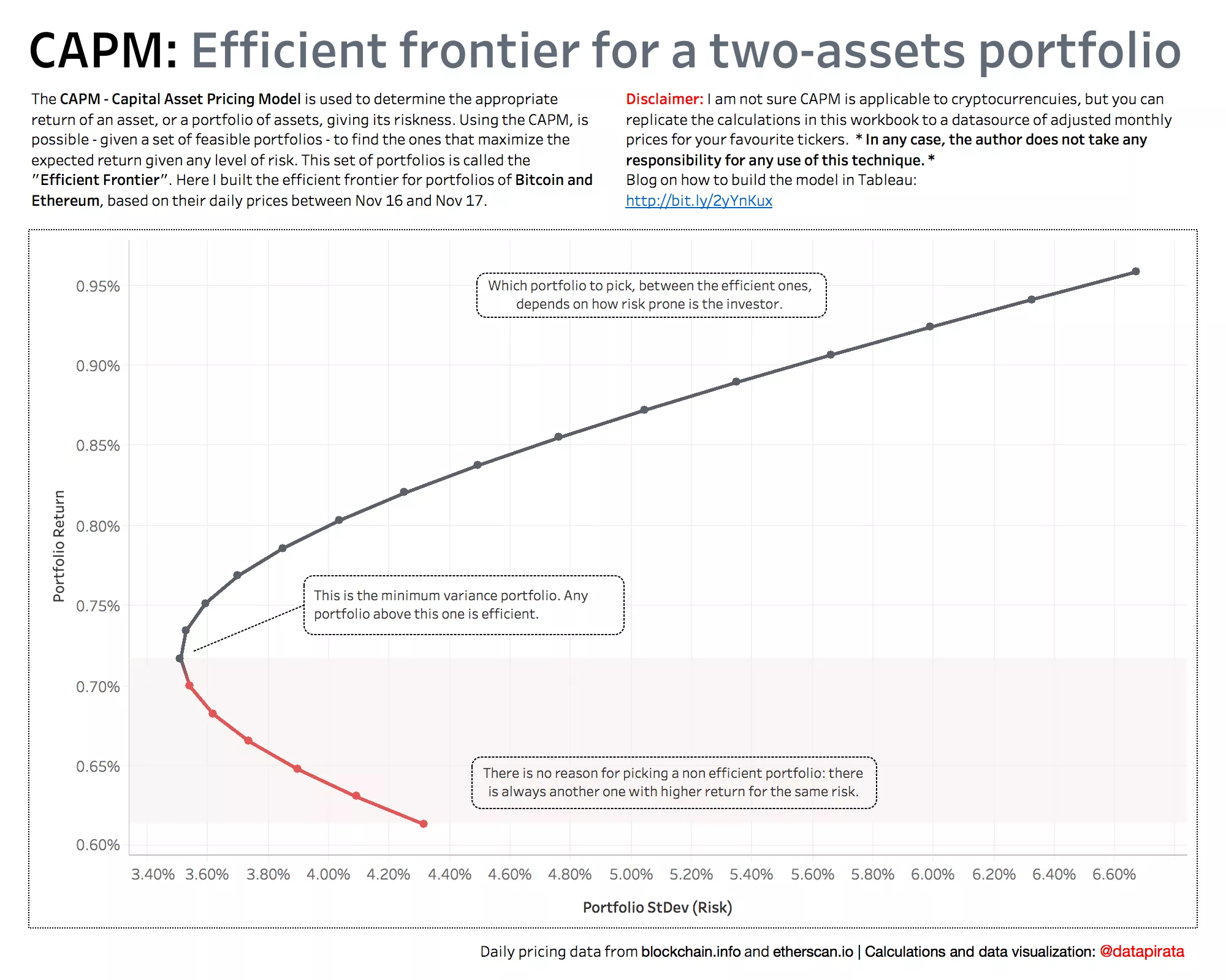
This month I am working with financial data, so I thought it was a good idea to refresh my financial mathematics knowledge replicating some simple Capital Asset Pricing Modelling (CAPM)...
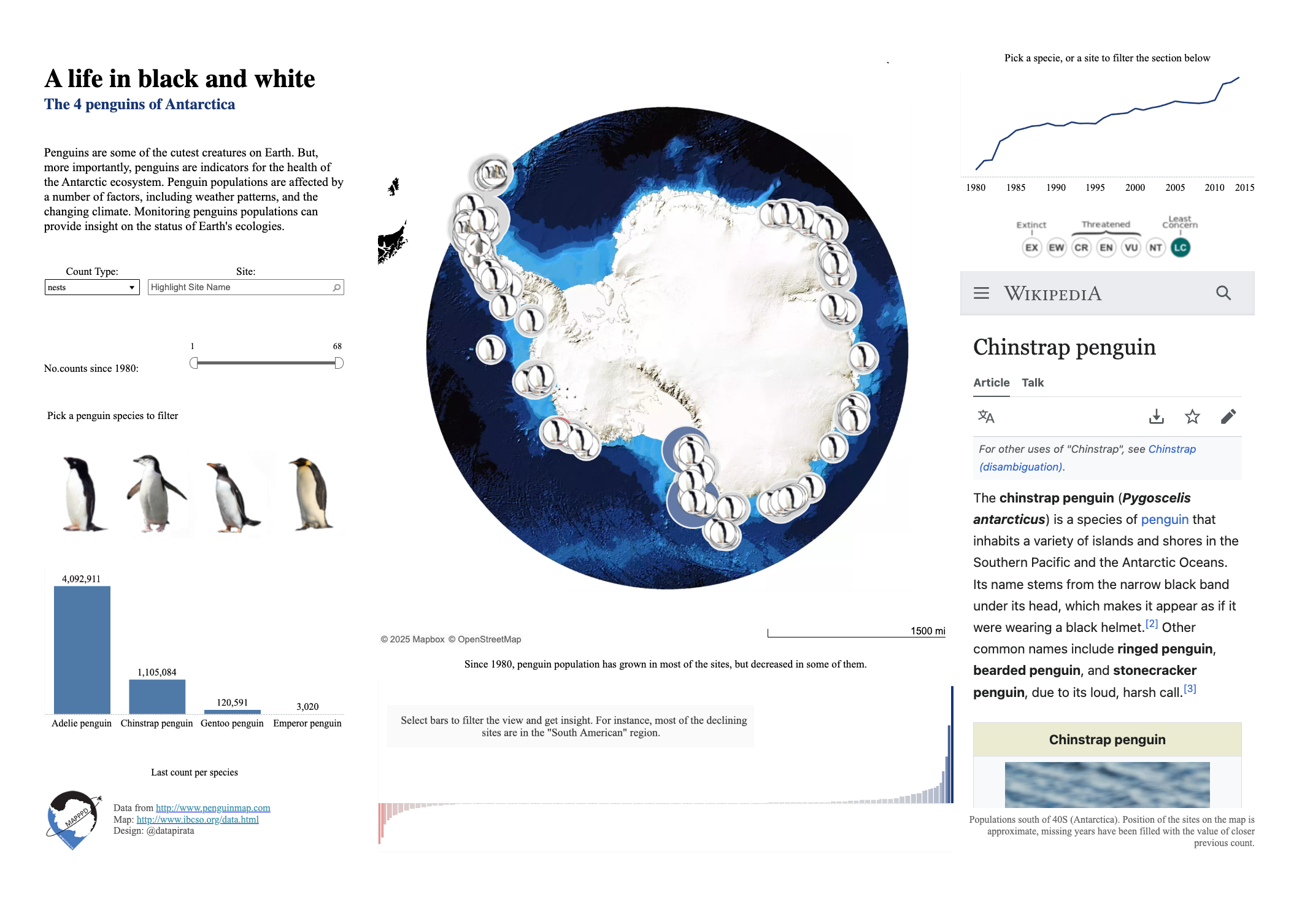
It’s that time of the year again, when Tableau hosts another round of the #IronViz competition. This time the topic is “Safari”: Animals & Plants. After playing around with a...
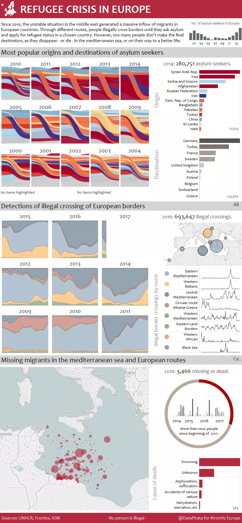
Since 2010, the unstable situation in the middle east generated a massive inflow of migrants in all European countries. Through different routes, people illegally cross borders until they ask asylum...
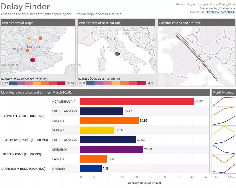
I really appreciate the power of constructive criticism in the #DataViz space. Given the importance of the audience in the data visualization process, feedback from peers is a gift to...
Since version 8, Tableau offers a native circle-packing algorithm to produce bubble charts.
Since version 8, Tableau offers a native circle-packing algorithm to produce bubble charts.
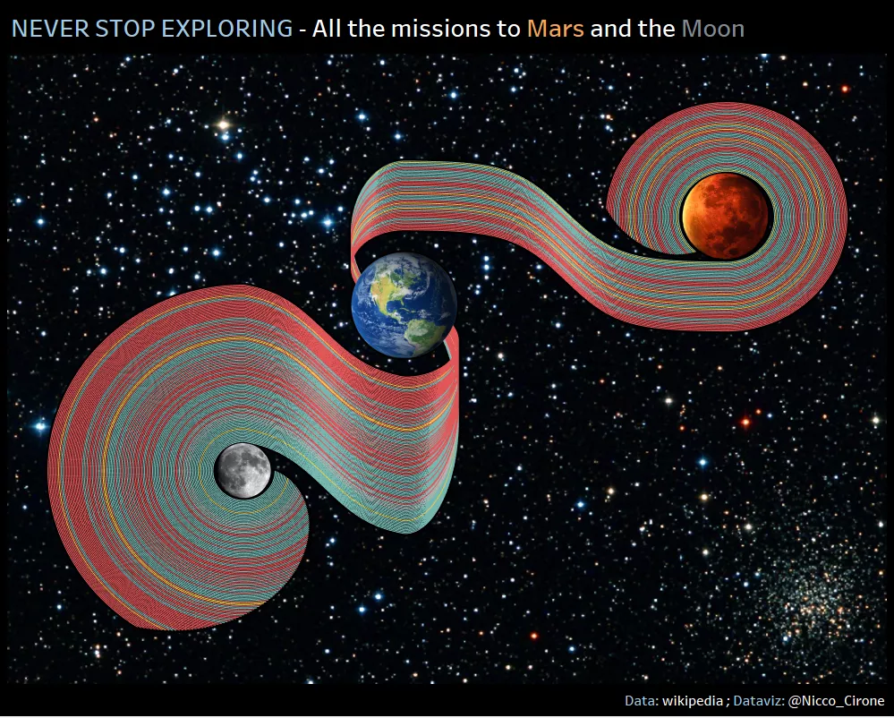
This week I spent my free time stretching and refreshing my (high school) knowledge of plotting exponential functions. Here below the end result: A visualization in Tableau of all the...
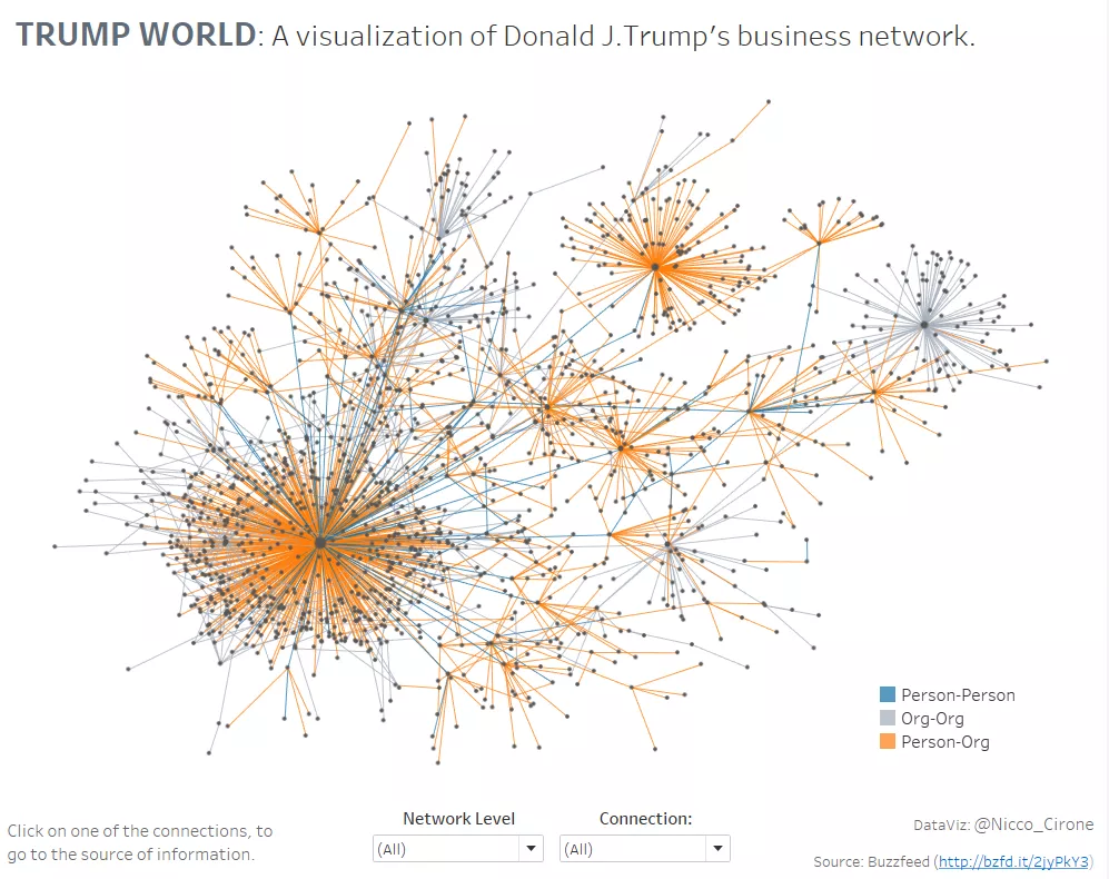
Last week, Buzzfeed released the output of a research they have carried on all the connections that Donald Trump holds with people and organizations.
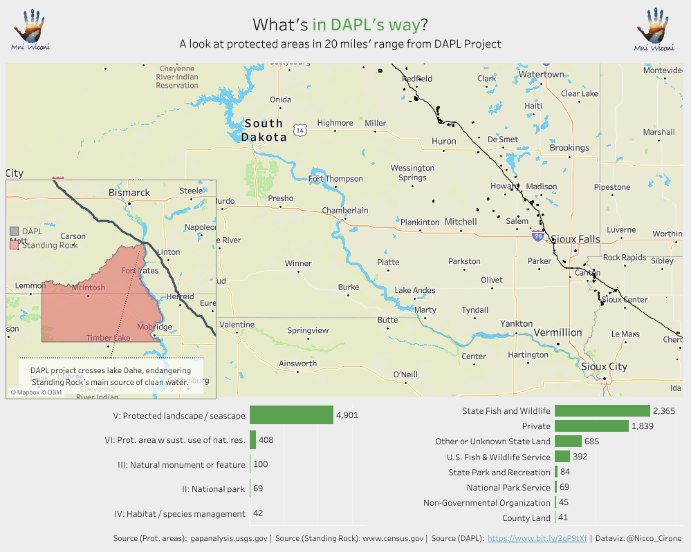
Mni Wiconi means “Water is life” in Lakota language, and it’s a slogan Native Americans are using in their protests against DAPL: the Dakota Access Pipeline.
Yeah, the title is provocative.
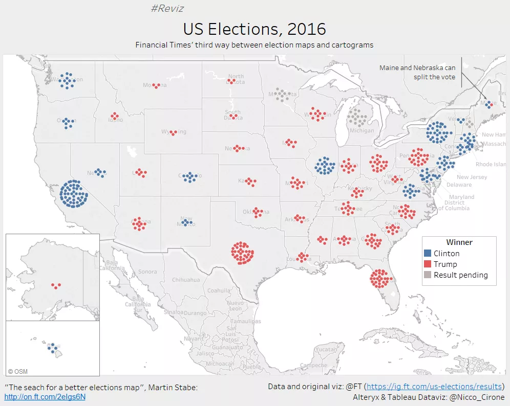
On Tuesday, the world wake up with a new POTUS, and the media were filled with data visualizations of the result. An electoral dataviz that never gets old is the “choropleth map”,...
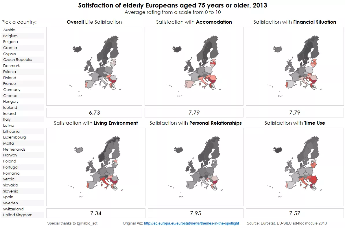
At the beginning of this year, I decided to get involved in the Tableau Foundation Service Corps: a group of people volunteering for charities and no profit organizations using Tableau....
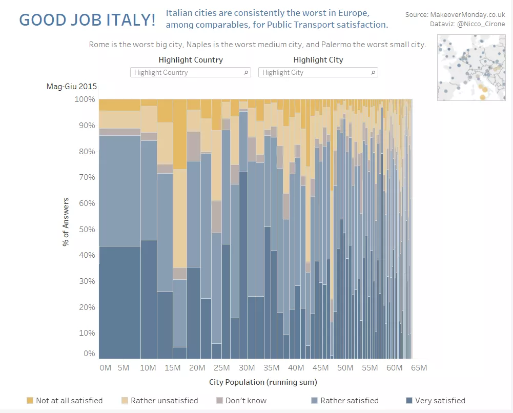
Siccome questa settimana, per lavoro, mi e’ servito imparare come si produce un Marimekko Chart in Tableau 10 (istruzioni in fondo), ho deciso di applicare subito quello che ho imparato a...
I dati sono vecchi, e’ vero, l’ultima rilevazione che si riesce a trovare e’ del 2013.
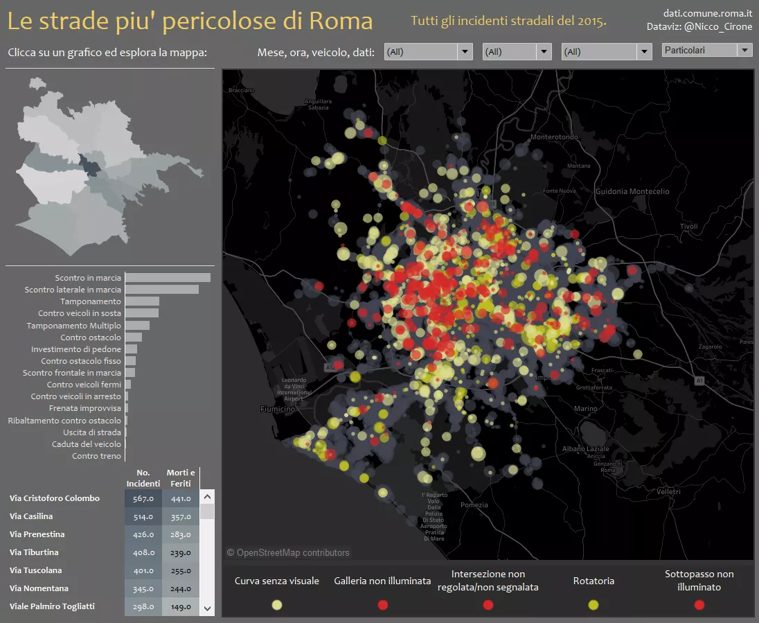
Segnaletica inesistente, intersezioni non regolate, luminosita’ insufficiente, buche: Tra le molte cause degli incidenti stradali, alcune sono legate ad incuria, o mancanza di investimenti. D’altra parte, è inevitabile che una...
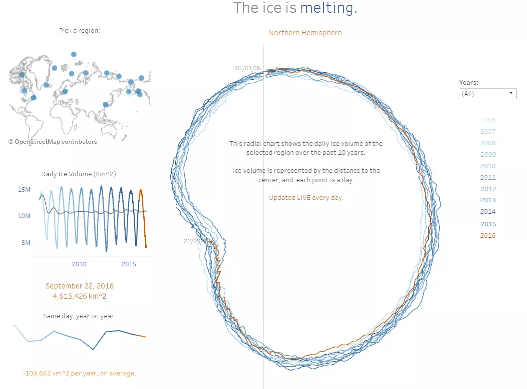
For this third and last Tableau #IronViz qualification round (follow the link and find my dataviz, if you want to vote for me!), I decided to build something using this cool...
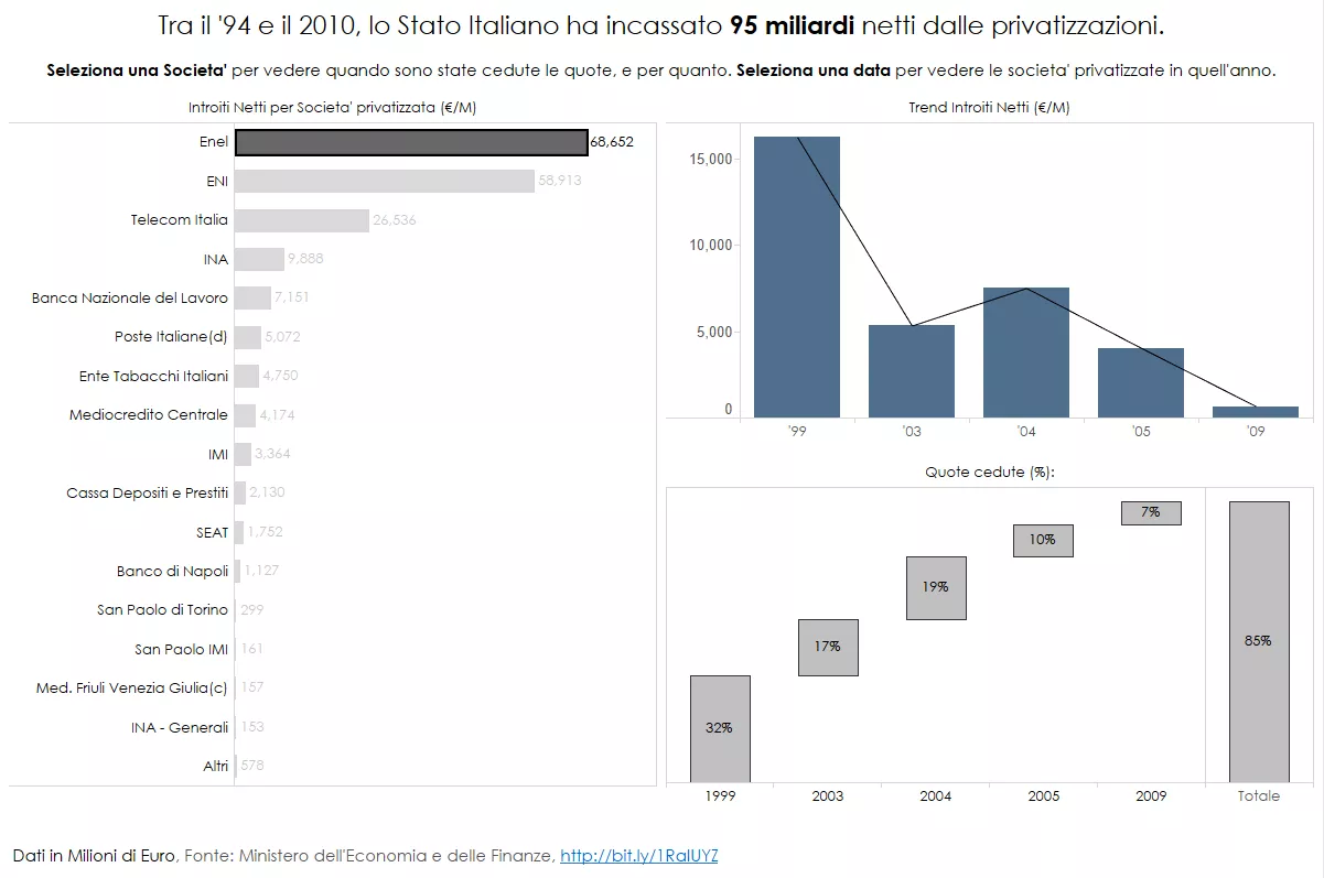
Qualche tempo fa mi sono imbattuto in questo tweet di @24InfoData, il Data Blog del Sole 24 Ore, rimandante a questa visualizzazione sugli introiti dello Stato Italiano provenienti dalla privatizzazioni delle societa’...
Category Tableau
This month I am working with financial data, so I thought it was a good idea to refresh my financial mathematics knowledge replicating some simple Capital Asset Pricing Modelling (CAPM)...
It’s that time of the year again, when Tableau hosts another round of the #IronViz competition. This time the topic is “Safari”: Animals & Plants. After playing around with a...
Since 2010, the unstable situation in the middle east generated a massive inflow of migrants in all European countries. Through different routes, people illegally cross borders until they ask asylum...
I really appreciate the power of constructive criticism in the #DataViz space. Given the importance of the audience in the data visualization process, feedback from peers is a gift to...
Since version 8, Tableau offers a native circle-packing algorithm to produce bubble charts.
Since version 8, Tableau offers a native circle-packing algorithm to produce bubble charts.
This week I spent my free time stretching and refreshing my (high school) knowledge of plotting exponential functions. Here below the end result: A visualization in Tableau of all the...
Last week, Buzzfeed released the output of a research they have carried on all the connections that Donald Trump holds with people and organizations.
Mni Wiconi means “Water is life” in Lakota language, and it’s a slogan Native Americans are using in their protests against DAPL: the Dakota Access Pipeline.
Yeah, the title is provocative.
On Tuesday, the world wake up with a new POTUS, and the media were filled with data visualizations of the result. An electoral dataviz that never gets old is the “choropleth map”,...
At the beginning of this year, I decided to get involved in the Tableau Foundation Service Corps: a group of people volunteering for charities and no profit organizations using Tableau....
Siccome questa settimana, per lavoro, mi e’ servito imparare come si produce un Marimekko Chart in Tableau 10 (istruzioni in fondo), ho deciso di applicare subito quello che ho imparato a...
I dati sono vecchi, e’ vero, l’ultima rilevazione che si riesce a trovare e’ del 2013.
Segnaletica inesistente, intersezioni non regolate, luminosita’ insufficiente, buche: Tra le molte cause degli incidenti stradali, alcune sono legate ad incuria, o mancanza di investimenti. D’altra parte, è inevitabile che una...
For this third and last Tableau #IronViz qualification round (follow the link and find my dataviz, if you want to vote for me!), I decided to build something using this cool...
Qualche tempo fa mi sono imbattuto in questo tweet di @24InfoData, il Data Blog del Sole 24 Ore, rimandante a questa visualizzazione sugli introiti dello Stato Italiano provenienti dalla privatizzazioni delle societa’...
Category Italy
Siccome questa settimana, per lavoro, mi e’ servito imparare come si produce un Marimekko Chart in Tableau 10 (istruzioni in fondo), ho deciso di applicare subito quello che ho imparato a...
I dati sono vecchi, e’ vero, l’ultima rilevazione che si riesce a trovare e’ del 2013.
Segnaletica inesistente, intersezioni non regolate, luminosita’ insufficiente, buche: Tra le molte cause degli incidenti stradali, alcune sono legate ad incuria, o mancanza di investimenti. D’altra parte, è inevitabile che una...
Qualche tempo fa mi sono imbattuto in questo tweet di @24InfoData, il Data Blog del Sole 24 Ore, rimandante a questa visualizzazione sugli introiti dello Stato Italiano provenienti dalla privatizzazioni delle societa’...
Category Ironviz
It’s that time of the year again, when Tableau hosts another round of the #IronViz competition. This time the topic is “Safari”: Animals & Plants. After playing around with a...
For this third and last Tableau #IronViz qualification round (follow the link and find my dataviz, if you want to vote for me!), I decided to build something using this cool...
Category Data Engineering
Last week, Buzzfeed released the output of a research they have carried on all the connections that Donald Trump holds with people and organizations.
At the beginning of this year, I decided to get involved in the Tableau Foundation Service Corps: a group of people volunteering for charities and no profit organizations using Tableau....
Category Alteryx
At the beginning of this year, I decided to get involved in the Tableau Foundation Service Corps: a group of people volunteering for charities and no profit organizations using Tableau....
Category Social Impact
At the beginning of this year, I decided to get involved in the Tableau Foundation Service Corps: a group of people volunteering for charities and no profit organizations using Tableau....
Category Thoughts
Yeah, the title is provocative.
Category R
Last week, Buzzfeed released the output of a research they have carried on all the connections that Donald Trump holds with people and organizations.
Category Coding
I like dark mode. Not because it’s trendy, but because it feels right. It’s easier on the eyes, especially when you’re reading or writing late. It saves battery. It’s good...
In June 2025, I set out to migrate my old blog from WordPress.com to a fast, clean, static site built with Jekyll and hosted on GitHub Pages. My goal: have...
Category Web Development
In June 2025, I set out to migrate my old blog from WordPress.com to a fast, clean, static site built with Jekyll and hosted on GitHub Pages. My goal: have...
Category Github
I like dark mode. Not because it’s trendy, but because it feels right. It’s easier on the eyes, especially when you’re reading or writing late. It saves battery. It’s good...