
This month I am working with financial data, so I thought it was a good idea to refresh my financial mathematics knowledge replicating some simple Capital Asset Pricing Modelling (CAPM) in Tableau. The CAPM is a set of mathematic rules used to price assets, based on the general idea that for an investment to be worth it, its risk must be rewarded by an appropriate rate of return. In this blog, I will show how to use Tableau to build the simplest CAPM model: the Efficient Frontier for a two-assets portfolio.
Click to go to the downloadable Tableau workbook
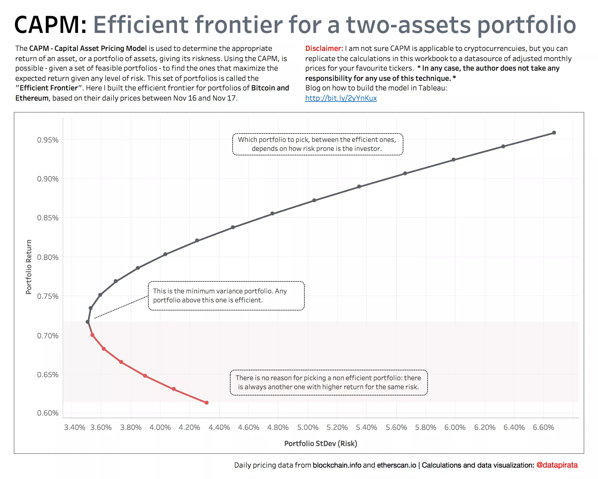
In Financial Modelling, the Efficient Frontier is that set of portfolios that maximize the expected return, given a certain amount of risk. In other words, if a portfolio is efficient, there is no other portfolio with the same expected return and lower risk.
In order to build the model in Tableau, I decided to try and apply the simplest CAPM model – the efficient frontier of a two-assets portfolio – to every millennial’s favourite investment: Bitcoin and Ethereum. I’m being a bit heroic and naïve here, as it’s very much not given that CAPM can be applied to cryptocurrencies, and I am far from being an expert in the matter – but hey, this is more about the Tableau technique, after all! Feel free to download the monthly adjusted stock prices of your favourite tickers from yahoo finance if you wish, and build the calculations on top of those.
**Important disclaimer** Be mindful that this method uses historical performance to infer the distribution of return and risk, and that the author does not take any responsibility for any use of this technique. The instructions below may contain errors, and either the calculations or the model itself may not apply to your specific use case. Always doublecheck every step until you are sure of your conclusions.
Let’s start!
- Computing the returns
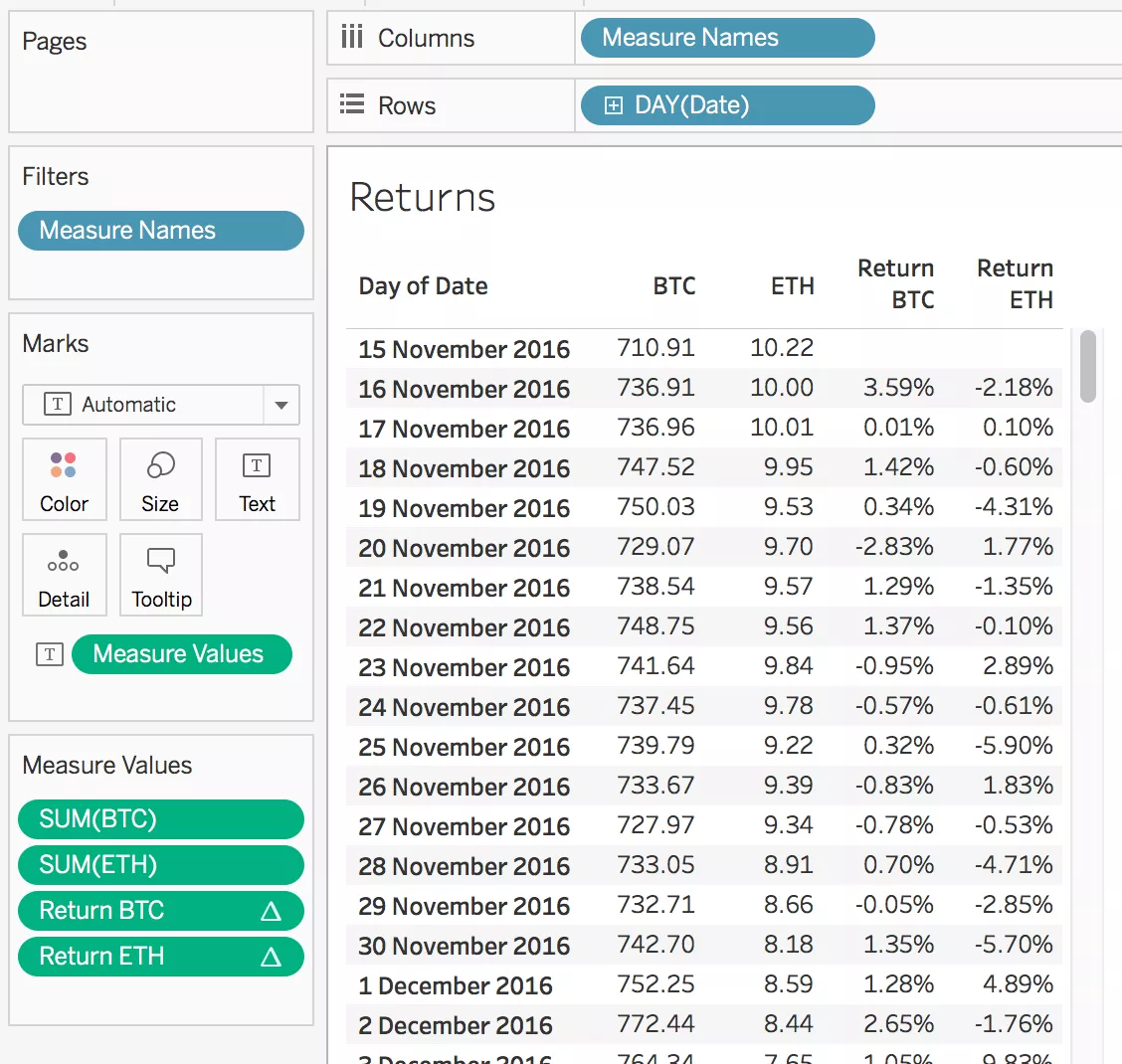
The first step is computing the continuously compounded returns of the two assets over time. Here, I am using daily prices of BTC and ETH, but you can use monthly adjusted stock prices. For each period in time, we want to compute the natural logarithm of the ratio between current price and previous price. To do so, we write our first two table calculations:
Return BTC -> ln(sum([BTC])/lookup(sum([BTC]),-1))
Return ETH -> ln(sum([ETH])/lookup(sum([ETH]),-1))
We can then build a table and check that we are getting the right results.
- Computing the assets expected returns and risk
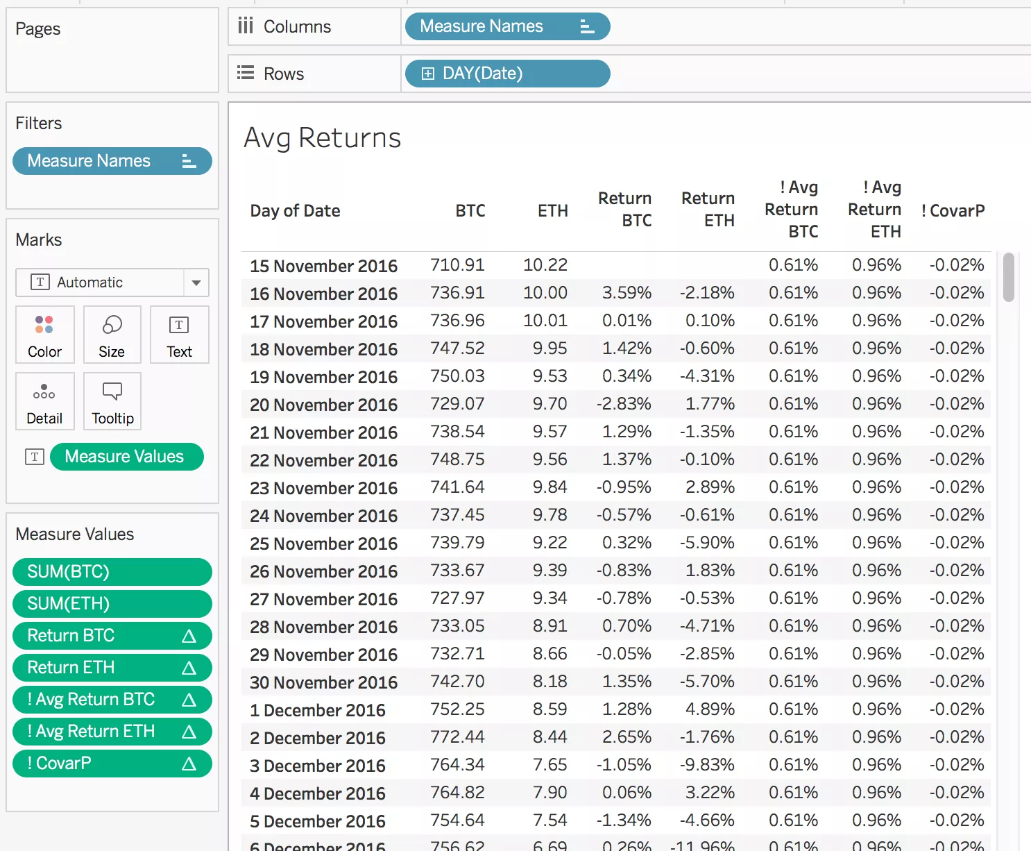
Because we are using the historical distribution to infer the performance of an asset in terms of return and risk, we can compute its expected returns as the average of its historical returns. In the same way, we use the standard deviation of those returns as a measure of volatility and, therefore, risk.
In Tableau, we need to compute those two metrics across the whole returns that we have found in step 1. We can use the following calcs (repeated for BTC and ETH):
Avg Return BTC -> window\_avg([Return BTC])
VarP BTC -> window\_varp([Return BTC])
StDevP BTC -> window\_stdevp([Return BTC])
Note that we use VarP and StDevP, as we assume the set of historical prices represents the whole distribution of the two measures. We also need another fundamental metric, which is the covariance between the two assets:
CovarP -> WINDOW\_COVARP([Return BTC],[Return ETH])
This is a measure of how similar the two stocks behave, and can also be normalized into a (-1,1) correlation index using:
Correlation -> WINDOW\_CORR([Return BTC],[Return ETH])
- Building the scaffold of example portfolios
To be able to plot the efficient frontier, we need a number of points representing different portfolios, i.e. different combinations of the two assets.
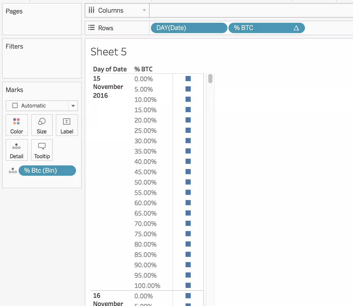
In order to do that, I created a second datasource that only has the dates for which I downloaded the asset prices, and a column of 0 and 1 which I have called [% Btc].
In Tableau, using this scaffold as my primary datasource, I can create bins of 0.05 on this measure, and draw a table as the following (Make sure you right click on the Bins pill and turn on “Show missing values”).
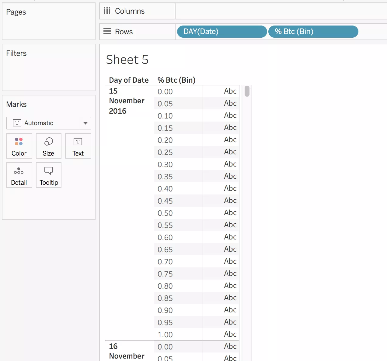
For each date, I now have a complete set of portfolios, where the weight of an asset can be any 5% increase from 0% to 100%.
The last step I need here, is to build a table calculation that will make use of these bins to trigger data densification, because I can’t use bins in the calculations I will need further on. If we assume the bins we generated are the fraction of the portfolio invested in BTC, we can then write the following calculated field:
% BTC -> PREVIOUS\_VALUE(-0.05)+0.05
and compute it by the bins, which we can now move to the detail shelf.
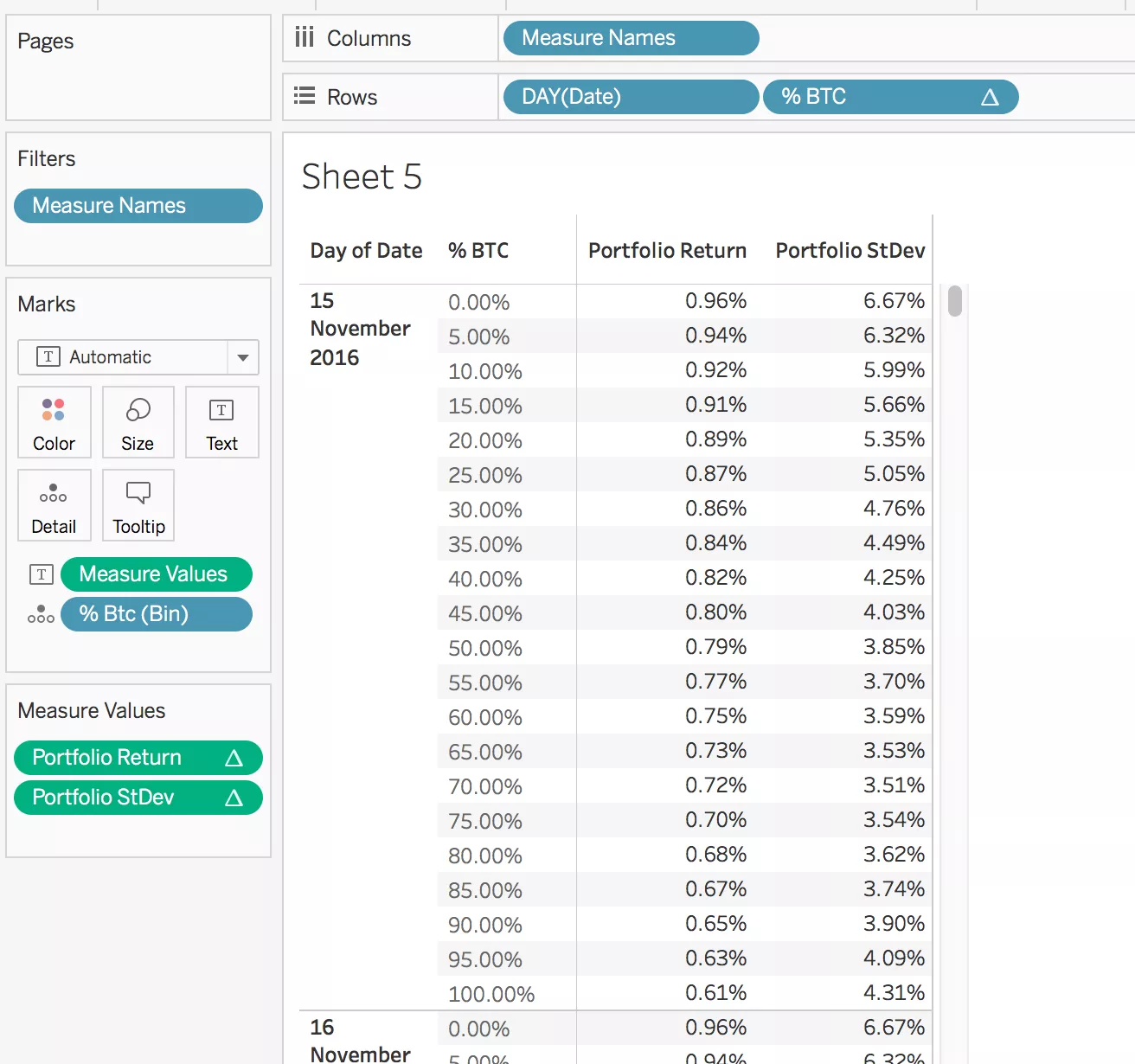
- Computing the portfolios’ return and standard deviation
Now, for each of these portfolios I want to compute the expected return and standard deviation. Staying in the sheet where the scaffold is the primary datasource, I can compute the portfolios’ return as:
Portfolio Return -> [% BTC]*[comparison].[Avg Return BTC]+ (1-[% BTC])*[comparison].[Avg Return ETH]
And the portfolios’ standard deviation as:
Portfolio StDev -> sqrt(([% BTC]^2)*[comparison].[VarP BTC] + ((1-[%BTC])^2)*[comparison].[VarP ETH] + 2*[% BTC]*(1-[% BTC])*[comparison].[CovarP])
Now, if we bring these two metrics in the table we can see the expected return and the standard deviation of the portfolio, which will depend on the % weight split, but will repeat the same values for each date split.
- Build the frontier
To build the frontier, we start moving the Portfolio Return calculation on rows, and the Portfolio StDev on columns. We then can remove the % BTC field from rows, and because we have the bins in the details shelf, the curves will now appear, split by date.
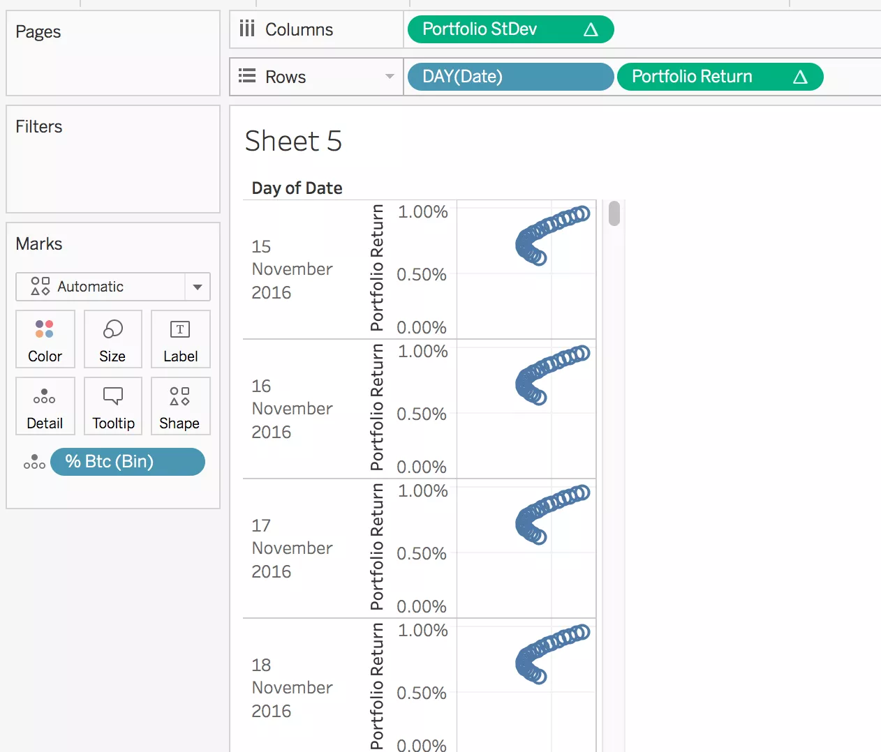
Now, before we can move the date to the Detail shelf as well, we need to make sure all the nested table calculations we are using are partitioned and addressed in the right way.
First, [% BTC] needs to be only addressed by [% Btc bins]. Then, the idea is that everything that is calculated at asset level needs to be addressed only by [Day of Date], and partitioned by portfolio weights ([% Btc bins]), while the Covariance, which is at portfolio level, needs to be addressed by both. So in the Portfolio Return calculation, every nested calc apart from % BTC is addressed by only [Day of Date], while in the Portfolio StDev calculation, we have the Covariance, which we address by both.
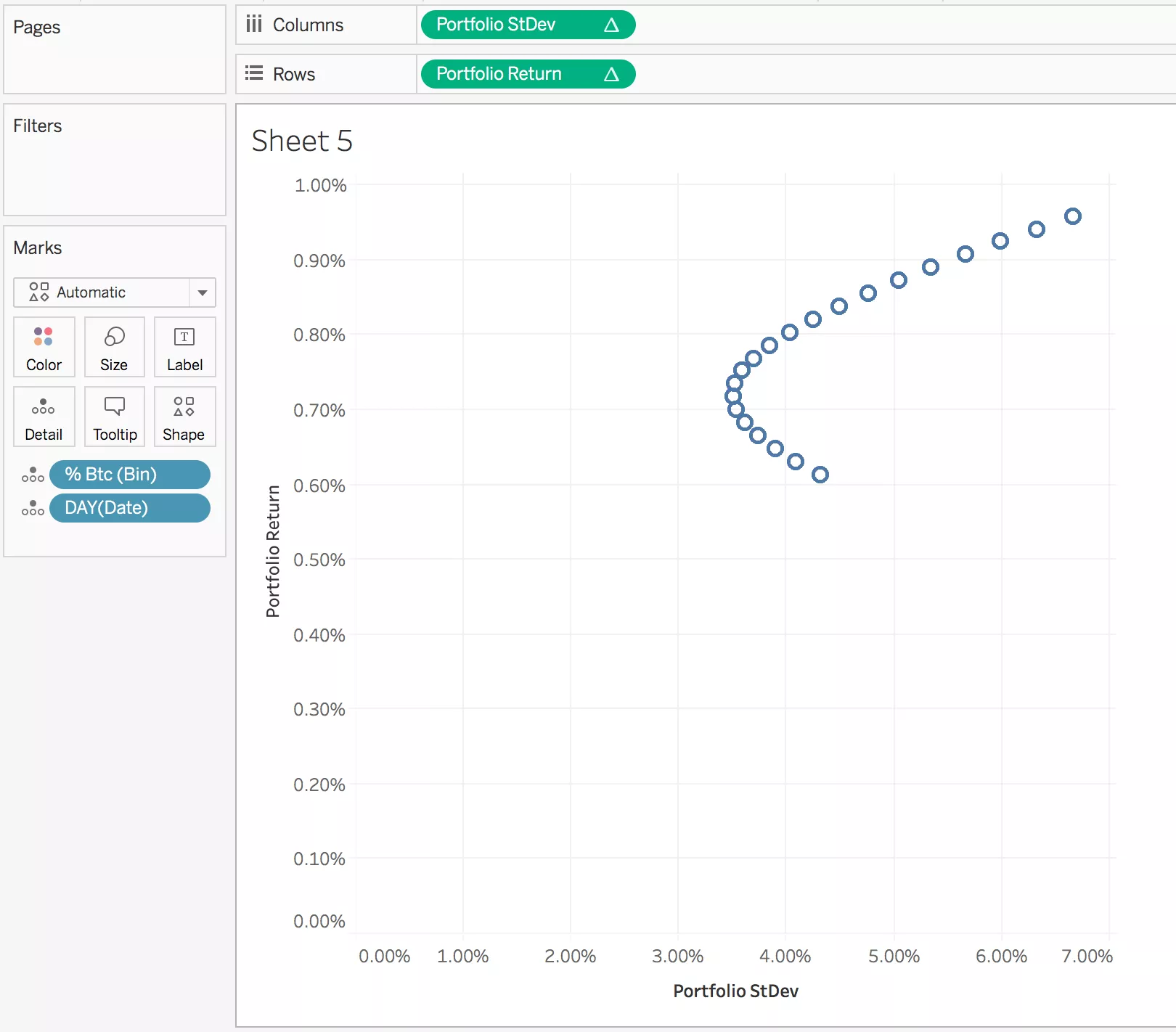
When we are done, we can move Date in the details shelf and we have our plot of returns versus standard deviation for the example portfolios.
The convex line that passes through them is the set of all feasible portfolios (without shorts and leverage).
- Final adjustments
In the final version of my chart, I coloured in black the efficient frontier – which is the part of the chart that maximises return, given the same amount of risk – and in red the rest of the chart. This is because every portfolio on the ‘red’ part of the chart will not be efficient, as there will be a portfolio with the same risk, but better return.
The portfolio that sits at the extreme left of the curve is the minimum standard deviation portfolio, so it’s the less risky between all the feasible portfolios of the two assets.
To find the efficient frontier, I wrote the following calculations:
Return of the minimum st dev portfolio -> window\_max(iif([Portfolio StDev]=window\_min([Portfolio StDev]),[Portfolio Return],null))
Return above Min StDev Portfolio -> [Portfolio Return]>=[! Return of the minimum st dev portfolio]
Where an investor decides to place their portfolio on the efficient curve, depends on how risk prone he or she is, and how much risk is willing to accept for a higher return.