
I really appreciate the power of constructive criticism in the #DataViz space. Given the importance of the audience in the data visualization process, feedback from peers is a gift to ask for and to encourage.
When criticizing a visualization, there are both technical and ethical rules to be followed, and I think most of them can be found in two main sources:
-
The #MakeoverMonday project, which every week picks a data visualization to improve, asking participants to stick to the original data, and constrain their time to an hour (to seek simplicity);
-
A framework recently published by Stephen Few, which proposes a structured way to assess the quality of a data visualization.
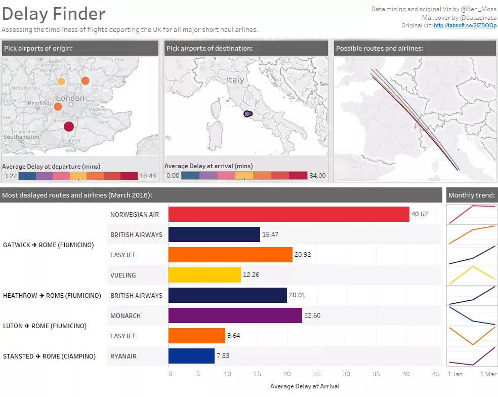
Some week ago, my good friend, colleague, and great data wrangler Ben Moss published a new viz about flight delays.
As an Italian expat in London, I can easily qualify as an interested audience, and I definitely had questions to ask the dashboard.

Here’s Ben’s dashboard:
 Click to go to the interactive dashboard
This peculiar cocktail of interest, good data, and friendship made me willing to apply to Ben’s dashboard the rules of both the MakeoverMonday project and the framework outlined by Stephen Few.
First, I downloaded Ben’s workbook from Tableau Public. I constrained myself to the fields I found and to an hour time. Then I started asking myself the MakeoverMonday questions:
What works:The data itself works very well for the story. The parameters let me focus on the routes I am more interested in (London-Rome in my case). The dashboard assesses the delays of the airports and the carriers alike. The great arcs make the dashboard engaging and pleasing to the eye. The little ASCII airplanes in the tooltips are a very neat touch.
What doesn’t and why: The stacked bar makes it hard to compare carriers. In order to avoid the most delayed flights, what I really want to assess is the mix of carriers and airports. If I select a single airport (either as origin or destination), the bar charts don’t make sense anymore. I can select a month/year, but if I want to know if a carrier is improving, or if there is a seasonality, I have to select each month separately.
How to make it better: Add a faster way to select just London and Rome airports. Find a better way to compare the combination of carriers and airports. Offer a time view to appreciate improvements/seasonality.
Then I evaluated the dashboard’s effectiveness based on Stephen Few’s framework:
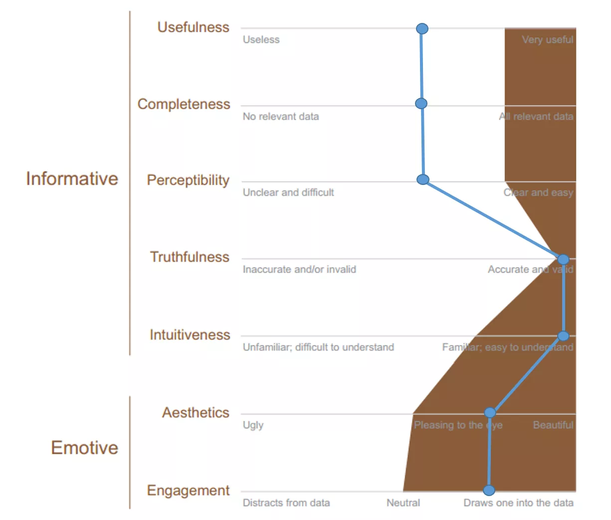
The dashboard is useful, but the ease-of-use can be improved by offering a faster way to select airports based on location and to compare actual carriers/airports combination. The completeness could be improved by adding more months to the underlying data, while the perceptibility is affected by the stacked bar. It is definitely truthful, as the average delays have been disaggregated by Ben in order to be then aggregated in Tableau at different levels of detail. The design is really intuitive, and the great arcs really help to visualize the routes, as well as enhancing the overall aesthetics and engagement of the visualization.
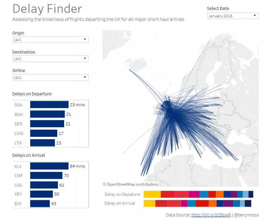
Below is my version of the dashboard. Click on the picture to go to the interactive tableau public viz.
Click to go to the interactive dashboard
I am really grateful to Ben for letting me experiment with #DataViz critics on his work, and I hope he will eventually pay back by criticizing one of my visualizations.