
At the beginning of this year, I decided to get involved in the Tableau Foundation Service Corps: a group of people volunteering for charities and no profit organizations using Tableau. At the time, I was really excited to join this project, as to me it represented a great opportunity to put my skills at the service of good causes.
And this has really been the case. Since then, I have been involved in a project that let me feel really helpful, and for which I am so grateful to who entrusted me with its implementation: the Humanitarian Response Map Review.
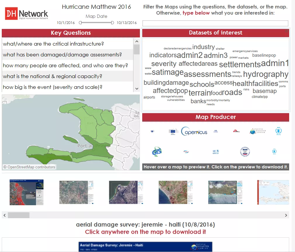
The output of the project is the dashboard below: basically a visual way for decision makers on emergency fields to quickly filter the multitude of maps created by various organizations and find the ones that suit their needs.
Click to go to the project’s site
The project started in April 2016, by creating a prototype using data from TC Winston, a typhoon in Fiji Islands.When the developing process was almost finished, a violent earthquake shook Ecuador, pushing us to stop iterating and implement it.
Three intense weeks started.
The Map Filter Dashboard is based on a google sheet that is updated by the amazing job of GIS volunteers. They go through each map and fill the different columns of the spreadsheet with the map’s metadata. The maps are stored in a google drive.
What I had to do was, at least once per day (with peaks of three times during the most intense days of the emergency), download the google sheet and the maps, and then point the dashboard’s datasource to the new google sheet and Tableau’s custom shapes to the new maps. Easier said than done, believe me!
In the end, the project worked pretty well and received great feedback from UN agencies and organizations like OCHA and UNOSAT.
However, the process was mostly manual and could have been optimized a lot.
That’s why when the project was re-activated for Hurricane Matthew, I decided to reshape the back-end with a couple of enhancements. First, I had the experience of the Ecuador crisis, and second I had learned a thing of two during those months!
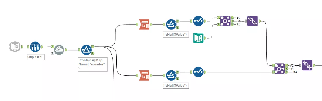
Here below the Alteryx module I came up with:
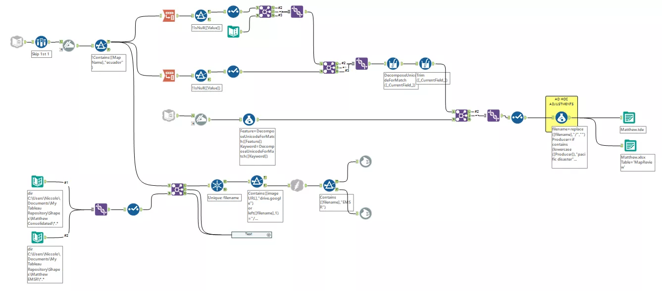
This workflow automates all the data scraping process: the only thing I have to do in order to update the dashboard’s datasource and the custom shapes folder is run it.
First, the google sheet input tool automatically connects to the spreadsheet the GIS volunteers are updating and get the metadata. In order to set up the google sheets input tool, I followed this great guide. I also created a google sheet API for this project, so that I don’t have to put my credentials into the workflow every time I run it.
After retrieving the data, the first step of the data preparation process is transposing - in two steps - the geographic data (for the map) and the metadata (for the word cloud and the key questions).
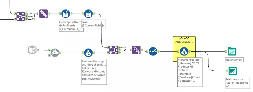
The second part of the workflow connects to a different sheet of the same google spreadsheet, where each of the datasets encoded in the maps is paired with a ‘word cloud friendly’ tuple. Then some ‘ad hoc adjustments’ get rid of typos and standardize names.
I finally output both a .tde (connected to the dashboard) and an excel file (just in case).
Now, on to the fun bit.
Besides the data preparation module, I take another stream from the google sheet connector, and I use it to download the maps and save them as custom shapes, ready to be used in Tableau.
Because in such emergencies the maps created are more than a hundred, I don’t want to download all of them every time I update the filter, but only the new ones. That’s why I put a directory input tools to read my custom shape repository and get the file name.
I then join those file names to the ones in the latest google sheet taking only the new ones, and I use a unique tool to avoid duplicates.
This stream allows me to use a download tool to get the images, and then a ‘blob output’ to save them as .png in my custom shapes folder.
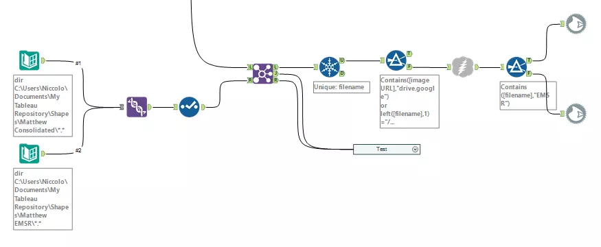
The only manual step still in place is to assign the correct custom shape to each map. Unfortunately, at the moment I am not able to automate this last bit being 100% sure that the match is correct.
I tried this technique from Jewel Loree: I use the acual file name on the ‘shape’ detail of my Tableau sheet so that the alphabetical order should be spot on. Unfortunately, this is not always the case, and sometimes I find Tableau assigning a different order to the shapes.
To help me through this issue, I ended up with two custom shapes folder: one only for maps which name starts with EMSR (as I found the order of those to be always right, and them being ~ 50% of all), and another one for all the other maps.
What I do in Tableau, is selecting the maps starting with EMSR, open the ‘EMSR Maps’ folder in the custom shapes and just hit ‘assign palette’ with confidence.
But for the other half of the shapes, I have to be more careful and to make sure all the matches are correct.
If you can think of a solution for this, I would love to hear from you; if I can find one, I will update this post.