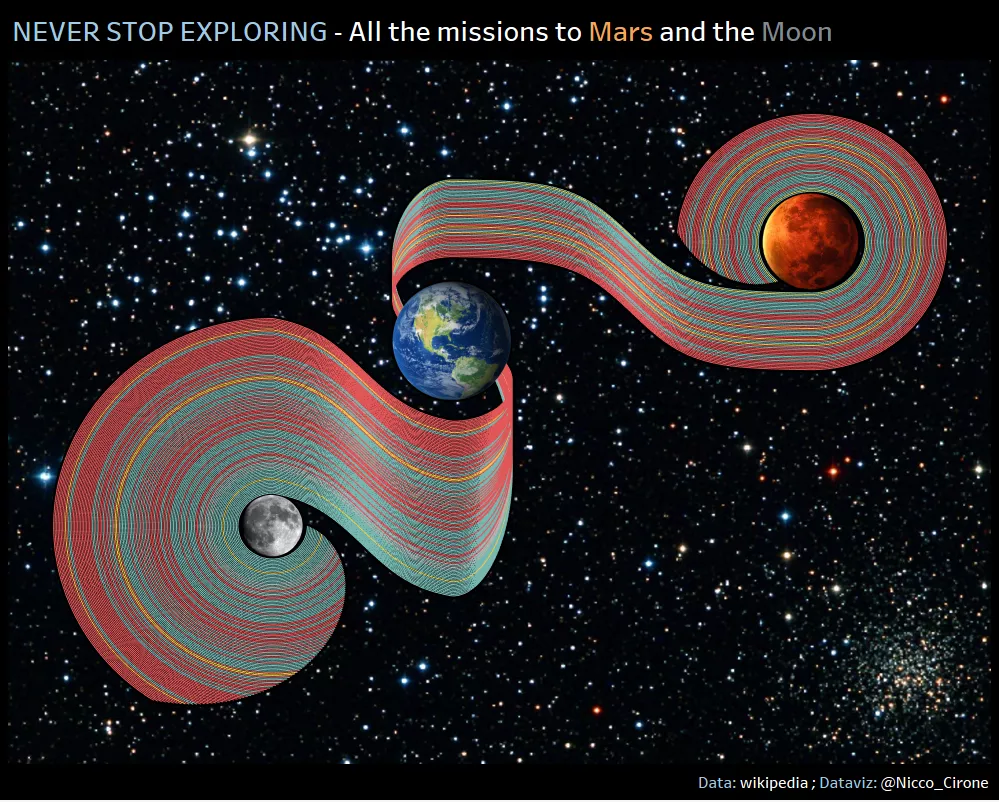
This week I spent my free time stretching and refreshing my (high school) knowledge of plotting exponential functions. Here below the end result: A visualization in Tableau of all the missions to Mars and the Moon so far, represented by curved lines and sorted by recency.
Click to go to the interactive tableau viz.
Where did the idea come from?
Last weekend, with some fellow Data Schoolers, I went to the exhibition “Maps and the twentieth century”, at the British Library (It’s brilliant, by the way).
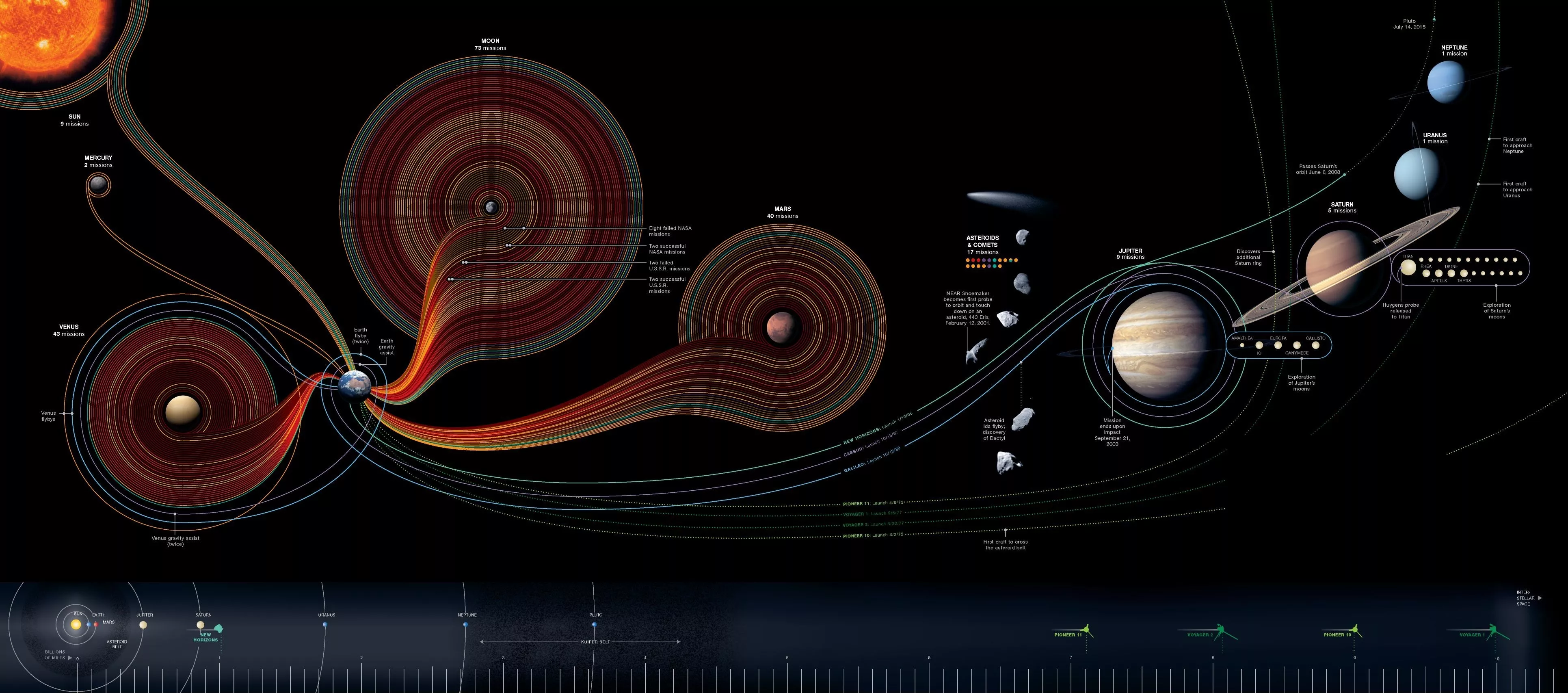
While waiting for people to come, I was leafing through the books in the Library’s shop and came across a munificent infographic from the NASA about missions to space:
I immediately asked myself if it would have been possible to mimic such great design in Tableau.
So, I first figured all the calcs in excel, and then I let alteryx do the heavy lifting of repeating the calcs for each mission, while tweaking the key parameters. First things first: the general concept of plotting functions in Tableau.
Since the very first moment I decided to commit myself to building such viz, I knew where to start for finding inspiration. I realized very quickly that what I needed was some way to split the complex curves into more elementary ones, and then combine them together.
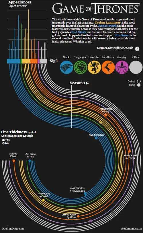
A bit like Adam McCann did in this epic Game of Thrones viz:
Click for interactive Tableau viz.
His curves are easier, though, as they are only two different portions of two circles with the same radius, one starting where the other ends.
What I really needed, was a combination of circles and sigmoids - with the end circles being parallels between to each other, and the starting circles tangent at a point. Then I needed a replica of the whole thing, on the other side of that point.
Sounds like a lot of geometry.
It is a bit of geometry, but definitely not rocket science. Below, I will illustrate all the steps I took in excel to build the curves (I won’t get too mathematical - what do I know! - and I won’t demonstrate the formulas. But you can do your research. They should be right.). If you like, you can follow the steps along and replicate the process yourself. The excel file with all the following calculations can be downloaded from here.
Crack on, then!
The first approach that came to my mind was to start drawing the circles, and then join the end points of the circles using the same sigmoids we use to create charts like sankeys, or this viz by Jeffrey Shaffer.
 Click for interactive Tableau viz.
But this won’t work!
Indeed it didn’t, and now I know, but it sounded reasonable at the time. Honestly, I didn’t think enough about the math underlying the sigmoids. But let’s get there later. The first thing I was off to were the circles.
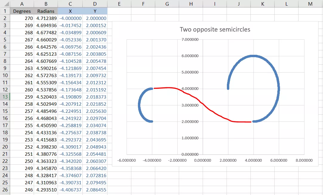
Circles are sets of points with the same distance r (radius) from the center, and they lay on angles from 0 to 360. Therefore, to draw the circles in excel, we start from a column of numbers from 0 to 360. We then need to multiply those angles for PI/180 to get the values in radians. The Cosine of those values will give us the “X” coordinates, and the Sine will give us the “Y” coordinates for a circle of radius one.
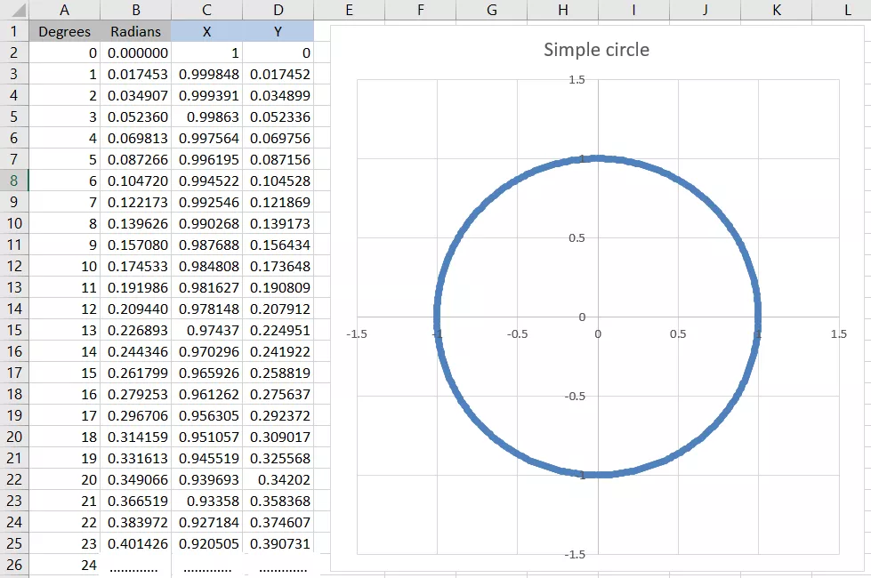
Sweet! Now we can also exclude some of the angles: degrees 0 to 180, for instance, will give us semicircles. We can also change other parameters to modify the shape of the circle: We can multiply X and Y for the same number to set the radius of the circle to be that number, or we can add a value to either the X or the Y, to move the circle on the cartesian plane.
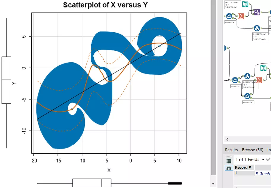
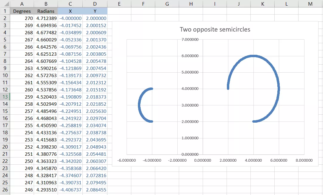
Tweaking those parameters, I ended up with two opposite semicircles of different angles, radii, and position, that I was then planning to join with a sigmoid:
 Let me introduce the Sigmoid
Sigmoids have been around for a while now. As in the example above, they are used to join two points with a curvy line (which can be also sized to get a sankey chart). Also, I knew straight away that the place to start from, when it comes to sigmoids, is Jeffrey Shaffer’s website Data plus Science.
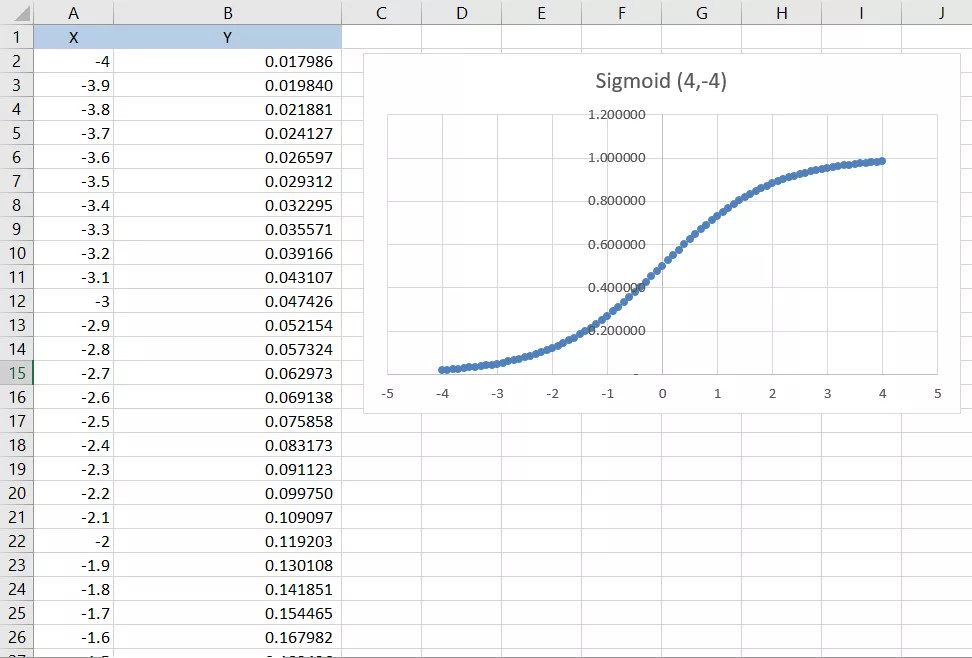
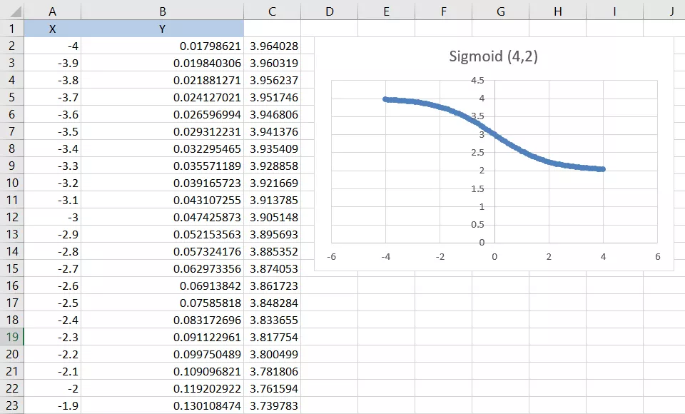
I started from the equation for a simple sigmoid (or ‘logarithmic curve’):
Y=1/(1+EXP(1)^-[X])
Easy peasy:
On Jeff’s website, I also learned that the way to connect two points with a sigmoid is changing that function to:
Y = sigmoid * [Y Origin] + ([Y Destination]-[Y Origin])
Where “sigmoid” is the above-mentioned sigmoid function, and clearly the X of the sigmoid goes between [X Origin] and [X Destination].
At that point, I thought I had all I needed to link the two semicircles I already built, and get the shape I wanted.
 Wrong, wrong, wrong!
I wanted to go from -4,4 to 4,2, so I drew a column of numbers between -4 and 4 (that would have been my X coordinates), and applied the formula I just found to those.
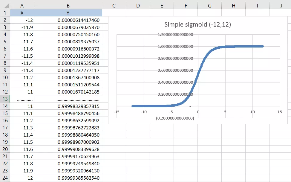
Seems quite right, but actually it’s not. What that formula does is to draw a sigmoid setting its asymptotes at the desired starting and ending point!
The asymptotes of the sigmoids are the lines toward which the curve tends, but that will never touch (well, at infinite does). The problem can be appreciated more easily with a wider sigmoid - the one below goes from -12 to 12. Note how it tends to 0 and 1, but never gets there:
Therefore, no matter how hard I tried, there was no way to connect the sigmoid to the circles, it was always slightly off!
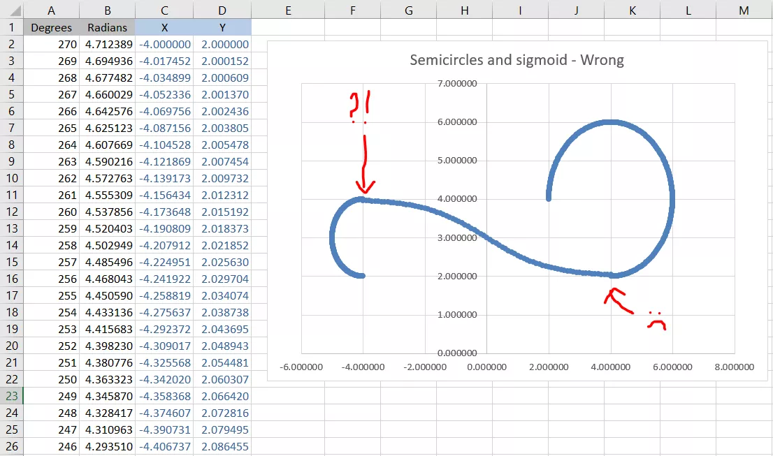
If this is OK in other visualizations, like sankeys and curve slope charts, it was awful in my viz, because it created an undesired “step” between the semicircles and the sigmoid. :(
If Mohammed will not go to the mountain, the mountain must come to Mohammed.
I had to change approach. Like Mohammed and the mountain, if the sigmoid won’t go to the circle, the circle must come to the sigmoid!
If I couldn’t (easily) have a sigmoid between -4,4 and 4,2, I would have drawn semicircles between -4,2 and -4,3.964028…. and between 2,4 and 4,2.035972….
Let’s start from the first one. As we want our semicircle to get to -4,3.964028…, we can set the radius of the circle to be (3.964028…/2), multiplying both X and Y for this value, and then add +((3.964028…-2)/2), to adjust the position of the circle.
For the second circle, multiplying for (2-D$263/2) both X and Y is enough to scale the circle to the right position. Here is the end result:
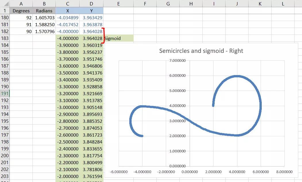
At this point, I created multiple columns in excel to assess the scalability of my model, setting the distance between each sigmoid to 0.5. to check my results and assess the scalability of this model
Note that because of the way the calculations are built, the second circle will get formed by different parallel circles, while the first one will always adjust having the “origin” in common.
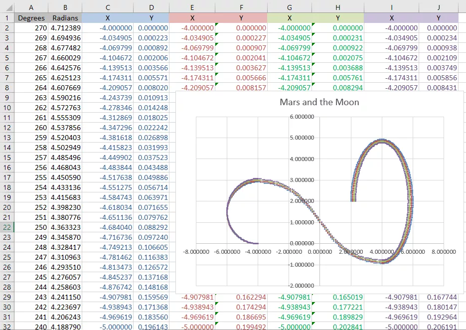
At this point, the only thing left was creating an alteryx workflow (find it here) to replicate those calcs, and create one curve for every single mission to Mars. Then invert the curves (-X and -Y), and add a curve for each mission to the Moon.
I also had to iteratively adjust the radii of the circles and their position to make them look nice. I also decided to scale the end of each circle, from 270 degrees of the inner ones, to less than 180 for the Moon’s most external one.