On Tuesday, the world wake up with a new POTUS, and the media were filled with data visualizations of the result. An electoral dataviz that never gets old is the “choropleth map”, like the one below:
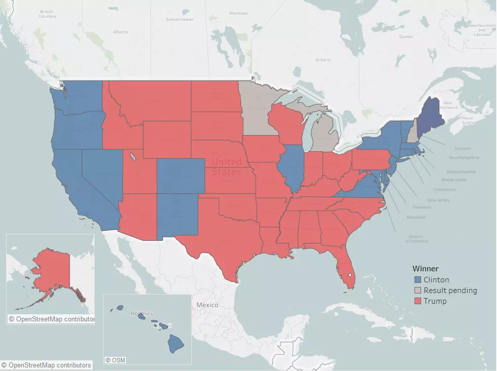
However, despite popularity and ease of interpretation, this map can be told inaccurate for a very simple reason: it suggests to the eye a disproportioned result, based on State’s areas, not actual votes.
Since large, rural states (with the same electoral weight than smaller states) in the latest times tend to vote Republican, the map tends to appear more red than it should. Alternatives have been put in places since the longest time, like cartograms that distort the shape of the states, to make the area proportional to the votes.
Alternatives have been put in places since the longest time, like cartograms that distort the shape of the states, to make the area proportional to the votes. However those are harder to read, and it is almost impossible to find small states at a glance.
Martin Stabe, head of interactive news at the Financial Times, explains the problem perfectly in this great article:
We’ve been running election maps and cartograms for years. This time, we’re trying to find a third way: https://t.co/4EG1rnP3Sd
— Martin Stabe (@martinstabe) November 8, 2016
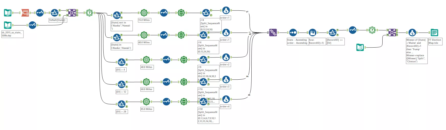
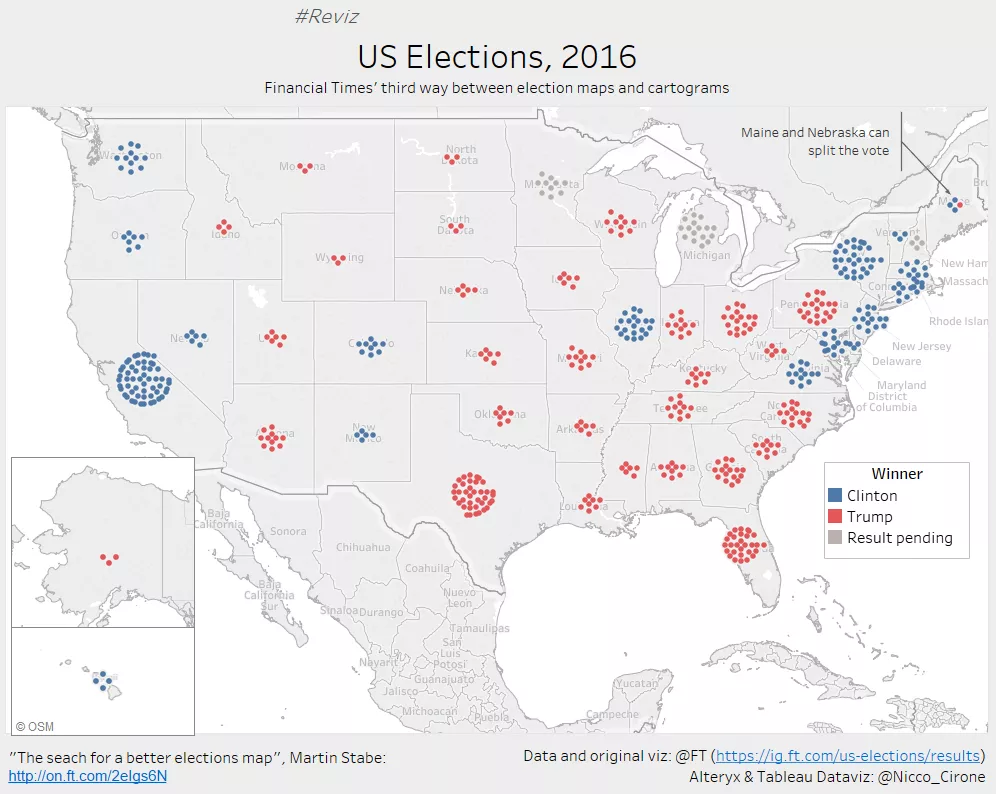
Provoked by the article, and pleased by the result of FT’s “search for a better map”, I decided to replicate their effort (coded in D3.js, find the repo here) using Alteryx and Tableau.
Here’s the final result:
Click to go to the interactive dashboard
In order to get there, I built the following alteryx workflow: