
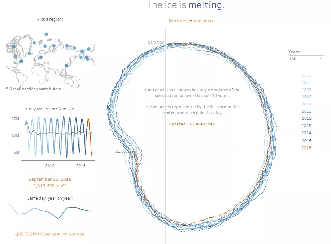
For this third and last Tableau #IronViz qualification round (follow the link and find my dataviz, if you want to vote for me!), I decided to build something using this cool dataset: a publicly available csv with ice extent in the northern hemisphere by region, updated daily.
As for the visualization, I chose to build a radial chart, because I had already built one focusing on the North Pole, and I quite liked the result. In this chart, each point is a day and each ‘circle’ is a year, while the ice extent is encoded in the distance from the center.
Using this dashboard, it is possible to get two information at a glance:
- The different seasonalities of the regions, that draw totally different shapes;
- The effect of climate change on the ice extent of different regions.
Click for the interactive dashboard
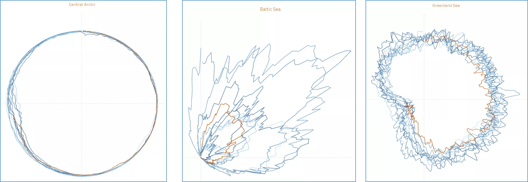
Central Artic, for instance, is almost always 100% covered by ice, except Jul-Sep when some of it melts. Contrariwise, Baltic Sea has never been fully covered, and in the latest year has suffered a huge reduction of ice coverage. Greenland Sea is never 100% covered, but also never fully melted, and the effect of global warming on it is slowly, but steady.
 Building the radial chart
Building this kind of chart in Tableau is all but difficult. All you need is to refresh some notions of goniometry to extrapolate the XY coordinates.
First, we need a ‘X’ variable, defined as:
X = (2*PI()/365*[#Day])
With [#Day] going from 1 to 365.
Because Cos(X) and Sin(X) would give us coordinates for a circle of 365 points and ray=1, we now want to multiply those by the metric to encode – in our case ‘Ice Extent’:
X Coord = cos([X])*[Ice extent]
Y Coord = sin([X])*[Ice extent]
The last step is dragging the coordinates on rows and columns, change the mark to be a line, and drag a field with the actual dates on the ’path’ shelf. That’s it!
Note that the csv I chose didn’t have a field like that, but only a field with a number formed by the year plus the day number (i.e. from 201601 to 2016365), so that I used this calc to build the date:
DATE(DATEADD('day',[#Day]-1,DATE(str([Year])+"-01-01")))
with [Year] being left([Day],4)