
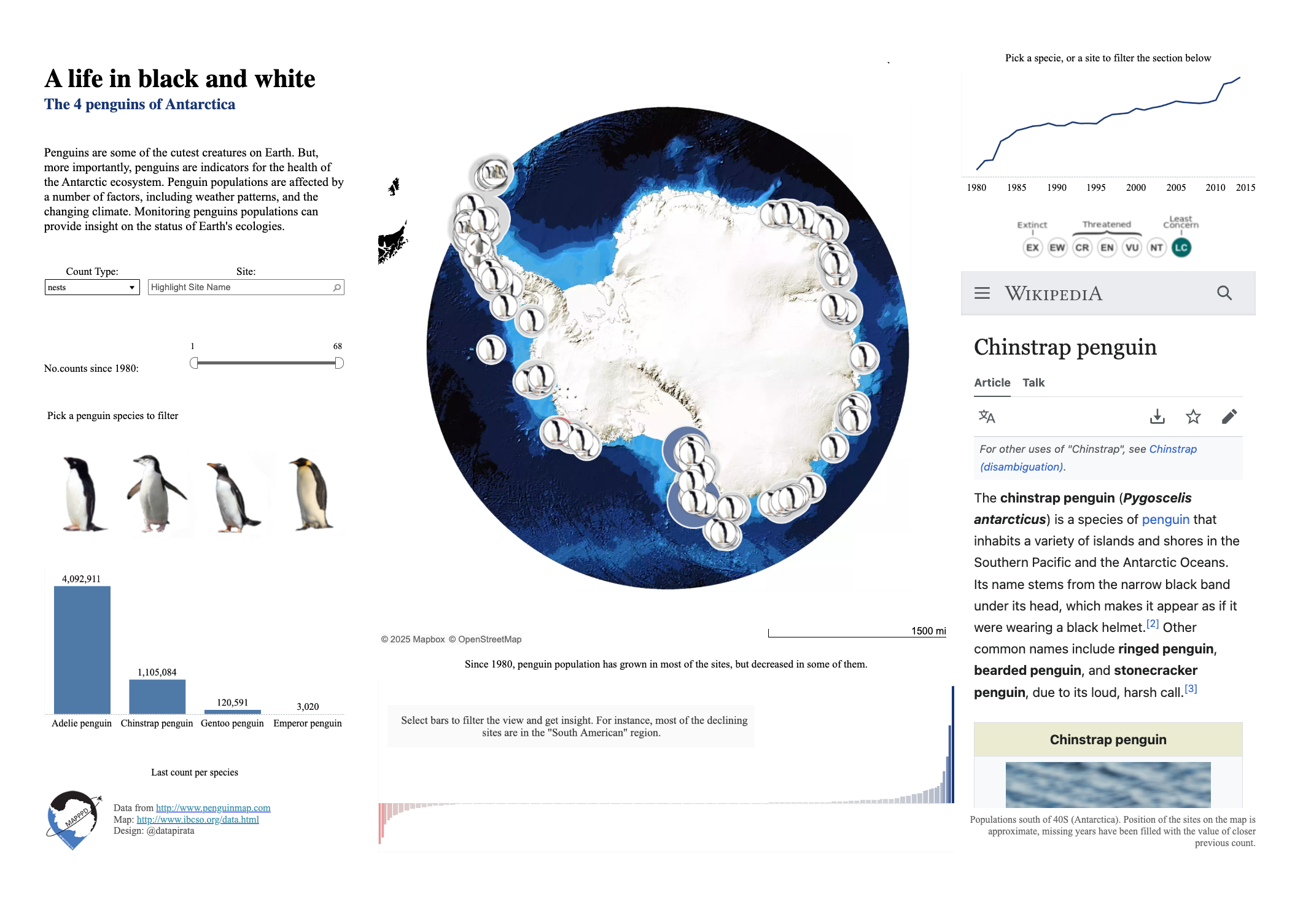
It’s that time of the year again, when Tableau hosts another round of the #IronViz competition. This time the topic is “Safari”: Animals & Plants. After playing around with a couple of datasets like the IUCN list of threatened species, and the London Fire Brigade animal rescue records, I decided to have a close look to some of the most interesting animals in the world: Penguins!
Here below is my final submission, built around a map of the Antarctic Penguins colonies which uses a polar projection in Tableau. If you want to know I achieved it, with a mix of alteryx and mapbox magic, this post is for you.
Click to go to the interactive dashboard
First of all, I have to thank Dr Grant Humphries and Dr. Heather J. Lynch to gave me green light to the use of their brilliant data. Their project, MAPPPD, is a relentless effort in collecting data on penguins to constantly monitor the health of the Antarctic and - ultimately- of our planet; find more info here.
Second, I wish I was the genius who came up with the mapping method, but I am not!
Her name is Sarah Battersby, and she explains it all here, a great blog post where she uses free and open source software to bend geography to her needs!
If you are in the lucky bunch who can access an alteryx license, your life is way easier though, and I am going to show you how you can achieve the same result with a couple of tools. However, I’d suggest you to read the original blog anyway, to thoroughly understand all the steps.
The point here is (as you already know because you read Sarah’s blog), Tableau can read the projection we are using out of a shapefile, and can plot Latitude and Longitude on a map. However, it will always use the same Lat/Lon projection for the map, no matter what. So we can’t get the stereographic map natively, we need to work a little with the data.
Step 1: We need polar coordinates.
Sarah’s method works using polar projected coordinates, which basically measure the distance from (0,0), on the South Pole. I had latitude and longitude in the data though, so the first thing to do is reprojecting the data into polar coordinates.
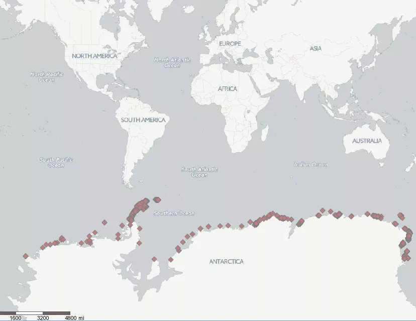
The sites are nicely unwrapped on a Lat/Lon projection
So first I create centroids out of the Lat/Lon fields, and then I can go ahead and use the “Spatial Info” tool to transpose the centroids on polar coordinates.
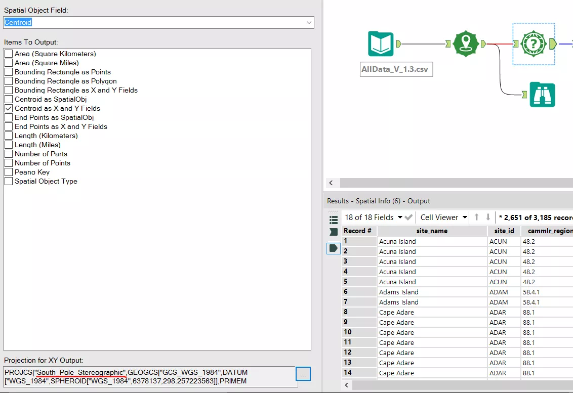
Using "centroid" spatial objects we transform Lat/Lon in polar coords
Nice.
Step 2: We lie to alteryx.
As in Sarah’s blog, we also need to lie to the tool, and tell alteryx that the projection is one that is not. To make it clear, if now I put a “Create point” tool, and tell alteryx to use the polar projection, the tool will bring me back to the starting point, i.e. will create a spatial object unwrapped on the Antarctic, then if I want to bring out the coordinates, I will need to specify a new projection.
What we really want, is to find a projection that keeps the relative position of the points, but plots it on the coordinate system our tools (Alteryx and Tableau) use.
To do this, we need a Pseudo-Mercator projection. So we lie to alteryx, and we tell it our data is in Pseudo-Mercator (while it’s not! It’s actually in polar stereographic but ssst!)
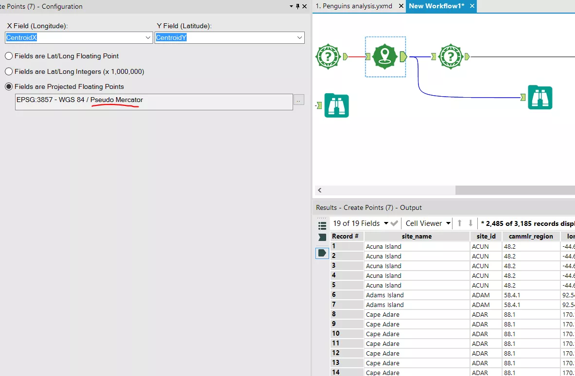
We create new points in a Pseudo Mercator projection
And this is the result:
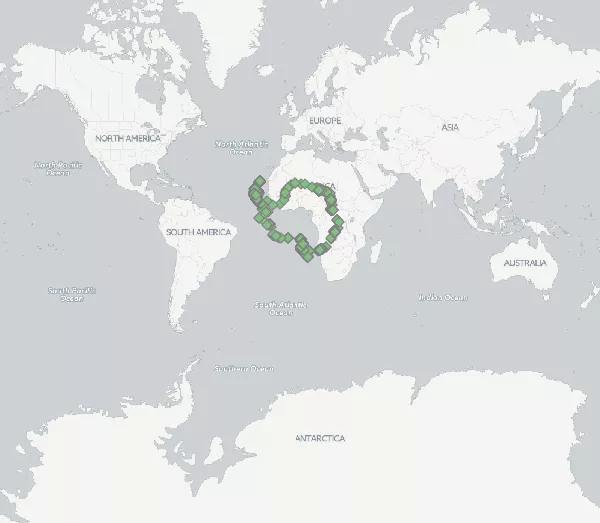
Antarctica is now in Africa. Sweet.
Doing this, we move Antarctica in Africa.
Pseudo-Mercator works because shifts the center (0,0) from the South Pole to our usual zero-zero point: The fascinating land of Null Island!
Fantastic, so what we need now is only to export those new spatial points in WGS84 Lat/Lon and we are good to go in Tableau.
All the other steps are the same as described in Sarah’s blog, so you can take it from here and replicate them. Basically, Tableau will plot your points in Africa - of course, is where we are telling it the data is! - but this is less than ideal.
So the next task will be to replace the classic tableau map, with a custom built map where we will have applied the same lies.
We can just repeat the same process above with a shapefile of continents,,, and then upload it on a custom map on mapbox. Here below the final result:
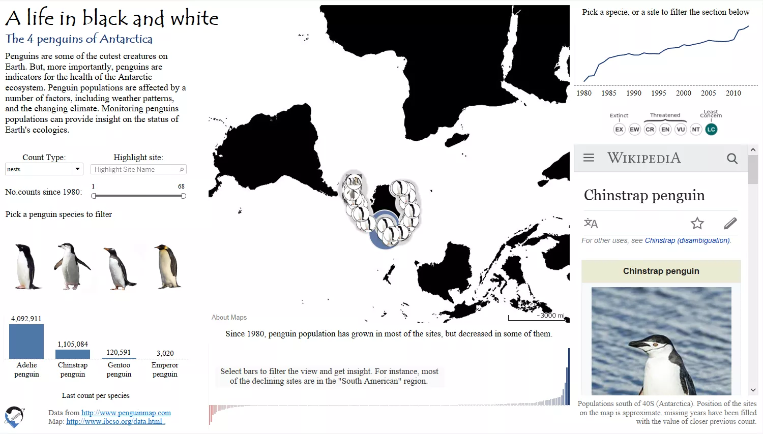
Funky!
Have fun with your polar data!