
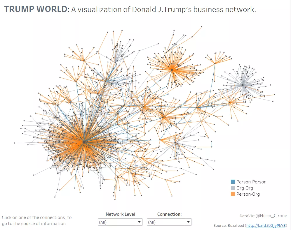
Last week, Buzzfeed released the output of a research they have carried on all the connections that Donald Trump holds with people and organizations.
I decided I wanted to visualize this dataset on a network chart, showing both the direct and indirect business connections of Trump. See below the end result (click for the interactive version).
Trump’s world: A network of Trump’s connections
In order to plot the chart, we need a model that assign sensible coordinates to each of the points, and unfortunately this is not natively available in Tableau.
However, we can find a number of such models in R! And for free!
All we need is some simple data preparation, seven lines of R code, a bit of very easy data wrangling, and we are done.
Having an alteryx license, I used that software to perform all those steps in a single workflow. If you do have alteryx, you can download the workflow here.
If you don’t have alteryx, don’t worry, I am going to tell you how to replicate all the steps using only excel and R studio.
First, let’s have a look at how the alteryx workflow works so we can identify the actions we’ll need to take in order to get the network chart done.
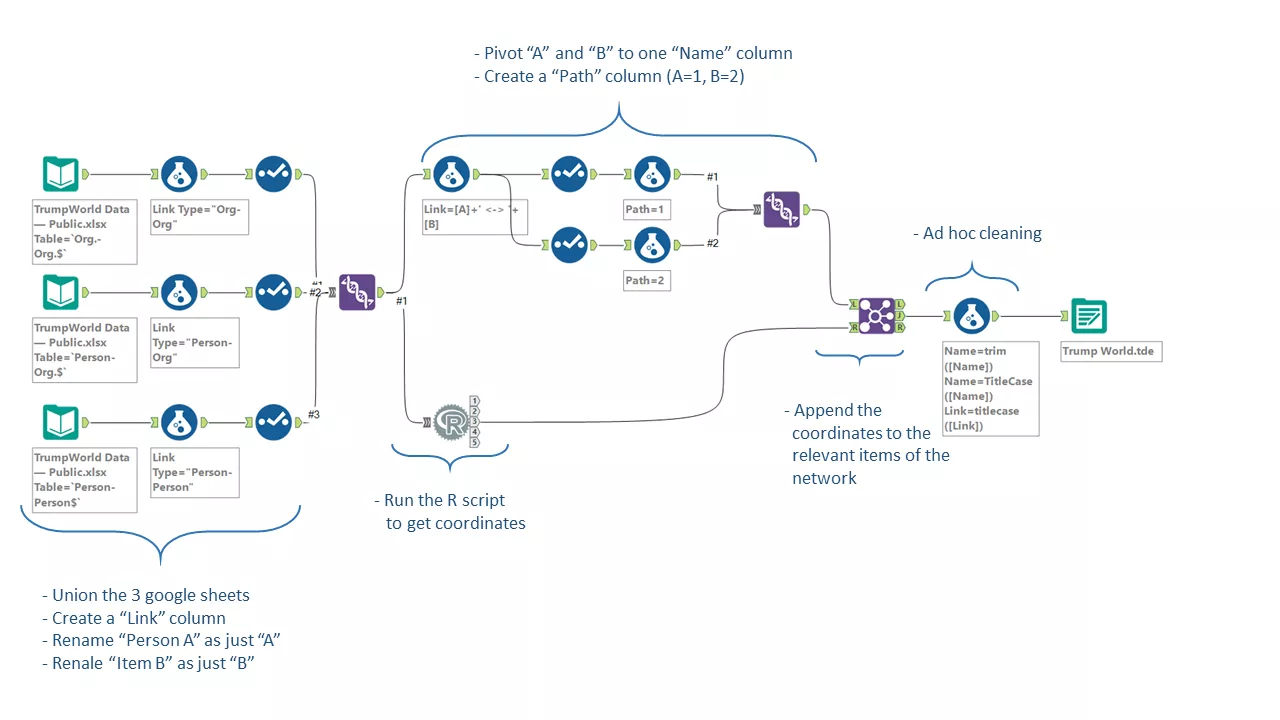
Now, let’s see how to replicate each of those steps:
- Download the google spreadsheet with the data here;
- Create a column in each sheet of the spreadsheet with the Link Type (“Org-Org”,”Person-Org”,”Person-Person”);
- In each sheet, rename all the columns signed with “A”, as just “A”(e.g. “Organization A” -> “A”) and all the columns signed with “B” as just “B”;
- Now unify the three spreadsheets into a single one, copying and pasting them to a new sheet. Make sure to match each column (“A” with “A”, “B” with “B”, etc), and to just have the headers once, at the beginning;
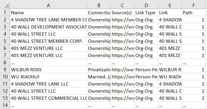
- Save the resulting dataset as a csv file. It should look like this:
[caption id=”attachment_1471” align=”alignnone” width=”616”]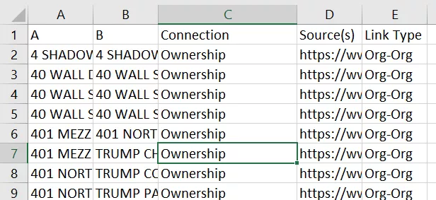 We cleaned the data, and are ready to go to R![/caption]
In R studio:
- Import the dataset. You can use Tools>Import dataset, or just write in your console:
Trump.dataset <- read.csv("[Your file path]/Trump dataset.csv")> View(Trump.dataset)
- Install “igraph” package. You can use Tools>Install packages, or just write:
install.packages("igraph")
- Declare the package, and build the model. Write in your console:
install.packages("igraph")
library(igraph)
g <- graph.data.frame(Trump.dataset, directed=TRUE)
plot(g, layout=layout.fruchterman.reingold)#fruchterman.reingold(g)*0.2)#, layout=l*1.0)
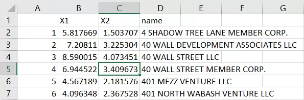
- Export your results as a new csv file. Write:
write.csv(data.frame(layout.fruchterman.reingold(g),vertex\_attr(g)),file = "[Your file path]/Trump network in R.csv")
Note that "fruchterman.reingold" is the model I chose for the network chart, but you can pick any of the available (see here), and get different results. Equally, you can change the other parameters.
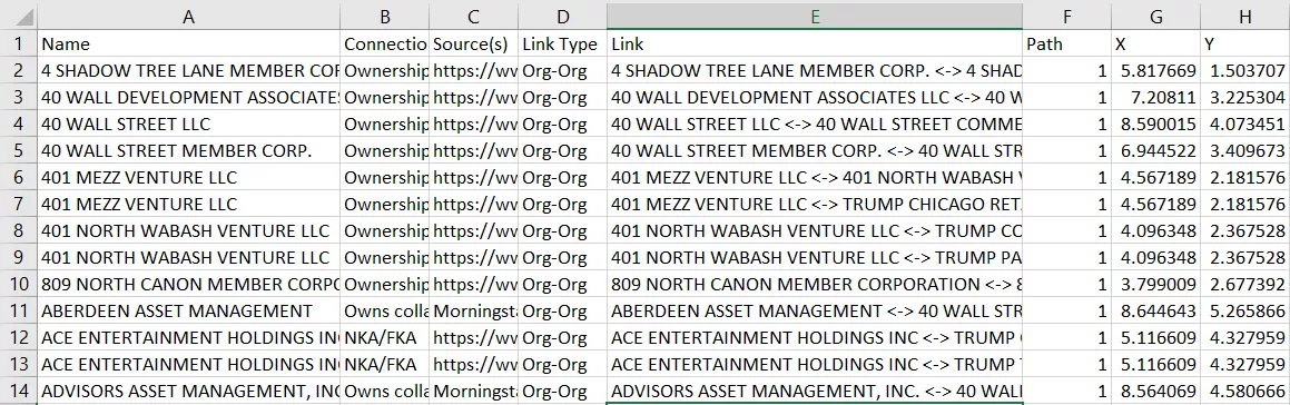
Now you have a csv with the coordinates and names of each point of the network chart. Something like this:
We are close now. In order to get the desired result in Tableau, we need to go back to excel and just perform a few more steps.
- We need to create a new excel spreadsheet where we copy the first csv file, the one we inputted in R, adding two columns, both called “path”, one with “1” for every record, and one with “2”.
- We also need a new column called “Link”, where we combine “A” and “B”, with a formula like:
Link =A2&" <-> "&B2
- We then pivot the “A” and “B” columns to a single column called “name”. I would just copy all the columns except from “A” and the “path” with “2”, then paste them after the last record of data (making sure column match - like “A” match with “B”, etc.). I would then delete the “B” column and the “path” column with 2 from the first half of the data, shifting cells left.
The result should look like this:
Now the last bit is to setup a lookup that assign for each “Name” the coordinates we got from R.
- Copy the csv file resulting from R in the spreadsheet where you are working;
-
Switch the order of the columns so to have “Name” “X1” “X2” - In the main sheet, create two new columns, “X” and “Y”, and setup a lookup formula for each that gets the coordinates from the other sheet. Like the following:
X =VLOOKUP('Trump dataset'!A2,'Trump network in R 2 - Copy'!$A$2:$C$1515,2,0)
Y =VLOOKUP('Trump dataset'!A2,'Trump network in R 2 - Copy'!$A$2:$C$1515,3,0)
- The result should look like this:
Now we have our dataset ready for Tableau!
In Tableau, just bring Y as columns and X as rows (both as continuous dimension), select “line” and drag “link” on detail and “path” on path.
Dual-axis the “X” (or the “Y”), select “dots” and drag “name” into detail.
Synchronize the axis, and you are done.
Feel free to ask for any additional explanation in the comments or on twitter, and share with me your network charts!
